Learn how to automatically highlight any developing problems in your z/OS infrastructure
This white paper demonstrates how IntelliMagic Vision can be used to obtain intelligence about threats in your z/OS infrastructure that are likely to lead to service disruptions for your users and applications or replication health.
The Health Insights will automatically highlight any developing problems. You can configure the thresholds to match the needs of your workload, such that IntelliMagic Vision will become more and more intelligent about your environment as you continue to use and configure the product.
IntelliMagic Vision provides Health Insights for:
- Disk Storage Systems
- Storage Groups
- System and Workload Manager
- Log Streams
- Coupling Facility
- Cross-system Coupling Facility (XCF)
- Db2
- CICS
- MQ
- TCP/IP
- FICON and Channels
- TS7700
Gain insight into how these Health Insights and over 2000 charts can help you identify and solve performance issues.
To download this white paper, please complete the form to the right, and we will send the file to your email.
Overall z/OS Performance & Health Status
The goal of IntelliMagic Vision is to identify potential issues before they impact applications. This is achieved by an intelligent rating system where workload measurements are combined and compared with the capabilities of the systems. The resulting ratings are shown in health insights charts that represent the health of your entire end-to-end z/OS infrastructure.
The health insight reports indicates infrastructure health by showing the key ratings for each part of the environment. Ratings are based on the analysis of thousands of underlying data points, making the health insight charts a very dense summary of hundreds of charts. The result is that issues and risks are flagged proactively before application performance degrades.
The dashboards show the summary; drill-downs allow you to explore details. The color and size of these bubbles show the ratings for the underlying metrics:
- a green icon indicates a healthy situation
- a yellow icon indicates that a problem is developing
- red icons flag more severe risks or issues
With these visual cues, it is extremely easy to see the health status of the entire environment at a glance. 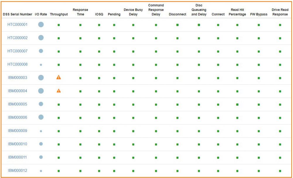
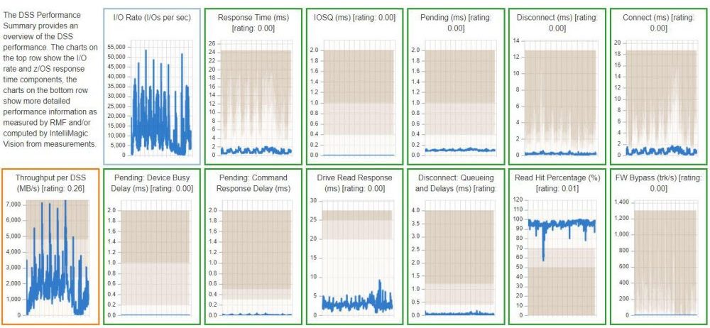
Investigate Performance Details
The health insights chart shown above provides the most compact view, but the rating is based on a very detailed level of analysis. To get more information about an issue, you can click on any icon to get to to the next level of detail. The icons are replaced by several related mini charts that show the metrics over time, as well as the rating and threshold values.
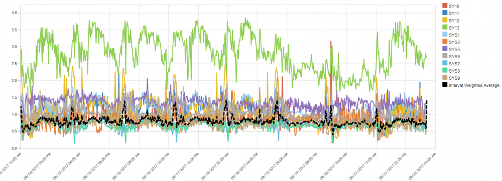
Root Cause Analysis
When the chart shows a problem, you can click on one of the mini charts to get a full version of the chart, which also contains an explanation of the metric and thresholds, as well as recommendations on what could be done to address the issue. The border of the charts is colored in the same way as the health insights chart:
- a green border means a healthy metric
- yellow is for early warning
- red indicates a larger issue
Each individual chart contains multiple drill-down options to go to the deepest level of detail in any direction, for example to find the individual RAID array that was so busy that it caused a large red circle for drive response time in the highest level dashboard.
Customizability
There are thousands of pre-defined charts and reports available in IntelliMagic Vision, grouped into logical sets. If you are interested in showing a combination of metrics or filters that is not available out of the box, you can customize the charts, or define your own from scratch and add it to your favorite chart set. The thresholds that are used in the rating system are also customizable to fit your situation.
All charts and reports can be exported to CSV, HTML, PDF, PowerPoint and Splunk.
Screenshot of the Relative Nest Intensity (RNI) Chart
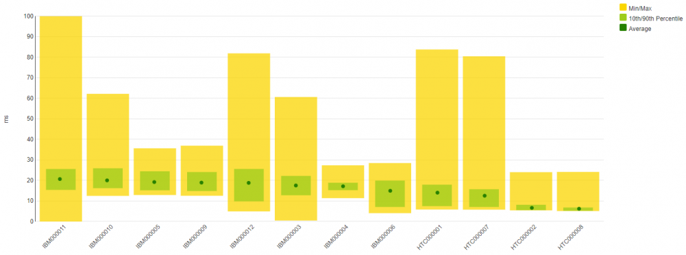
Balance Charts
Many metrics are best shown as line or area charts, but some values are better looked at in a different fashion. The variance chart, for instance, is a great way to show (im)balance. In the example below, you see the FICON throughput per port.
- a green dot indicates average throughput for the port
- a green rectangle that shows the standard deviation
- a yellow area that shows the minimum and maximum value over the entire period
Screenshot of zOS Back-end Write Response Time for all Storage Pools