SAN Management and Performance Monitoring with Predictive Intelligence
The goal of IntelliMagic Vision is to identify potential issues before they impact applications. This is achieved by an intelligent rating system where workload measurements are combined and compared with the capabilities of the systems. The resulting ratings are shown in dashboards that represent the health of your SAN Storage and Switches.
There are separate dashboards for the storage systems, for virtualization engines such as IBM Spectrum Virtualize (SVC), and for the Fibre switches.
The dashboard indicates infrastructure health by showing the key ratings for that part of the environment. Dashboard ratings are based on the analysis of thousands of underlying data points, making the dashboards a very dense summary of hundreds of charts. The result is that issues and risks are flagged proactively, before application performance degrades.
Watch the video below for an in-depth look at our Dashboards and Ratings.

Benefits and Capabilities of IT Infrastructure Monitoring
Overall Health Status
The dashboards show the summary; drill-downs allow you to explore details. The highest level dashboards are color-coded bubble dashboards, as shown below. The color and size of these bubbles show the ratings for the underlying metrics:
- green bubble – indicates a healthy situation
- yellow bubble – indicates that a problem is developing
- red bubble – indicates more severe risks or issues.
With these visual cues, it is extremely easy to see the health status of the entire environment at a glance. IntelliMagic Vision can be set up to send emails automatically when a dashboard contains one or more yellow or red warnings.
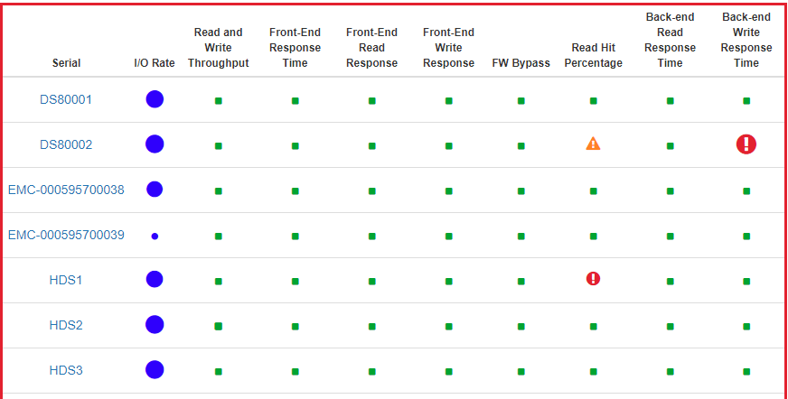
Screenshot of Disk Storage System Health Dashboard
Investigate Details
The bubble dashboard shown above provides the most compact view, but the rating is actually based on a very detailed level of analysis. To get more information about an issue, you can click on the bubble to get to the next level of detail, where the bubbles are replaced by mini charts that show the metrics over time, as well as the rating and threshold values.
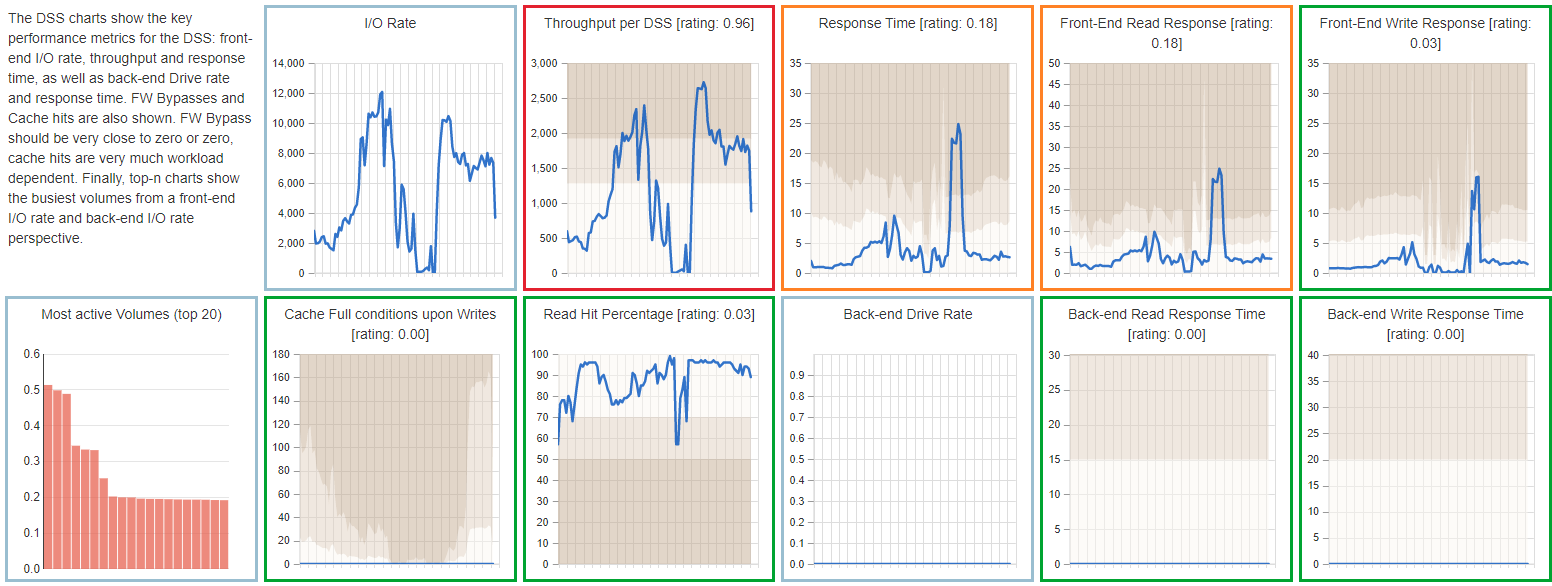
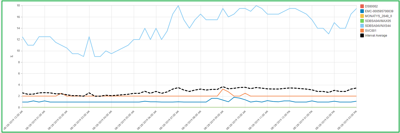
Screenshot of dashboard mini charts
Root Cause Analysis
When the dashboard shows a problem, you can click on one of the mini charts to get a full version of the chart, which also contains an explanation of the metric and thresholds, as well as recommendations on what could be done to address the issue. The border of the chart is colored in the same way as the bubble dashboard:
- green border means a healthy metric
- yellow is for early warning
- red indicates a larger issue
Each individual chart contains multiple drill-down options to go to the deepest level of detail in any direction. For example, to find the cause of the large red circle for back-end write response time in the highest level dashboard.
Customizability
There are thousands of pre-defined charts and reports available in IntelliMagic Vision, grouped into logical sets. If you are interested to show a combination of metrics or filters that is not available out of the box, you can customize the charts that are there, or define your own from scratch and add it to your favorite chart set. The thresholds that are used in the rating system are also customizable to fit your situation.
All charts and reports can be exported to CSV, HTML, PDF, Powerpoint and Splunk.
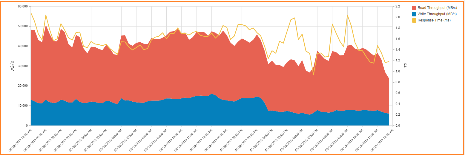
Screenshot of Throughput and Response time chart for all DSS chart
Balance Charts
Many metrics are best shown as line or area charts, but some values are better looked at in a different fashion. The balance chart, for instance, is a great way to show (im)balance. In the example below the fibre throughput for each port on an HDS VSP G-Series array is shown.
- the green rectangle shows the standard deviation
- the yellow area shows the minimum and maximum value over the entire period
This chart shows immediately that there is an imbalance between the storage ports: the first port, CL3-A, carries the majority of the workload.
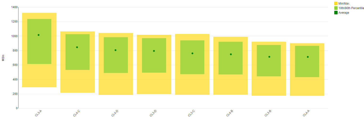
Screenshot of Fibre Throughput Balance chart
Example: Front-end or Host Adapter
Often the aggregate throughput of a SAN storage system’s front-end (host) adapter is less than the sum of the individual ports. Unfortunately, most tools do not report the cumulative throughput or I/O rates for an entire front-end adapter. IntelliMagic automatically computes the sum of the key metrics for all Fibre ports on a given front-end adapter to provide the utilization of the adapters.
Screenshot of Front-end Adapter Utilization chart
Related Content
How to Detect and Resolve “State in Doubt” Errors
IntelliMagic Vision helps reduce the visibility gaps and improves availability by providing deep insights, practical drill downs and specialized domain knowledge for your SAN environment.
Finding Hidden Time Bombs in Your VMware Connectivity
Seeing real end-to-end risks from the VMware guest through the SAN fabric to the Storage LUN is difficult, leading to many SAN Connectivity issues.
Platform-Specific Views: Vendor Neutral SAN Monitoring Part 2
Each distributed system platform has unique nuances. It's important for a solution to be capable of getting the detailed performance data capable of supporting vendor-specific architectures.