Troubleshooting Hitachi VSP and HUS VM Performance Issues
Managing performance in a virtualized storage environment can be tricky. See how you can troubleshoot performance across your Hitachi Enterprise Storage Environment (VSP, HUS VM, G-Series, F-Series) and easily identify the root cause of performance issues.
In this video, we demonstrate how you can proactively monitor and manage performance in your Hitachi storage environment. With key drilldowns starting with the high-level key performance metrics, down to the Configuration, Service Statistics, Balance, Host Groups, Logical Devices, Front-end, and Back-end, see the value of a new level of visibility and navigation for your data.
IntelliMagic Vision for SAN allows you to monitor the performance, capacity, and configuration across your multi-vendor SAN storage, fabric, and VMware to ensure you meet your SLAs.

Video transcription
In this short video we provide an overview of our Hitachi support, specifically for the virtual storage platform: the HUS VM platforms. The first place I’m going to start is our health insights or system dashboard. This shows me all of the controllers on the y-axis and all of the key performance indicators across the top.
A couple of things to note: the colors are important. Red means bad, yellow means warning, green means good. Blue is a kind of a relative color. We don’t rate the I/O rate based on one of the stop light colors, because it’s not really an indicator of the health of the box so much as is the throughput and the response times. The rating is an indication of how much time we spend above the thresholds. You can look at the thresholds for each of these systems by clicking on the thresholds tab. The thresholds are built into this software and they’re based on the make and model and the configuration of the systems. In this example, I’ve got a box named HDS8 that’s got really some exceptions around the throughput and some warnings around the response time. You’ll notice that when I hover over these it shows the definition, so you know what you’re looking at, and it shows the rating.
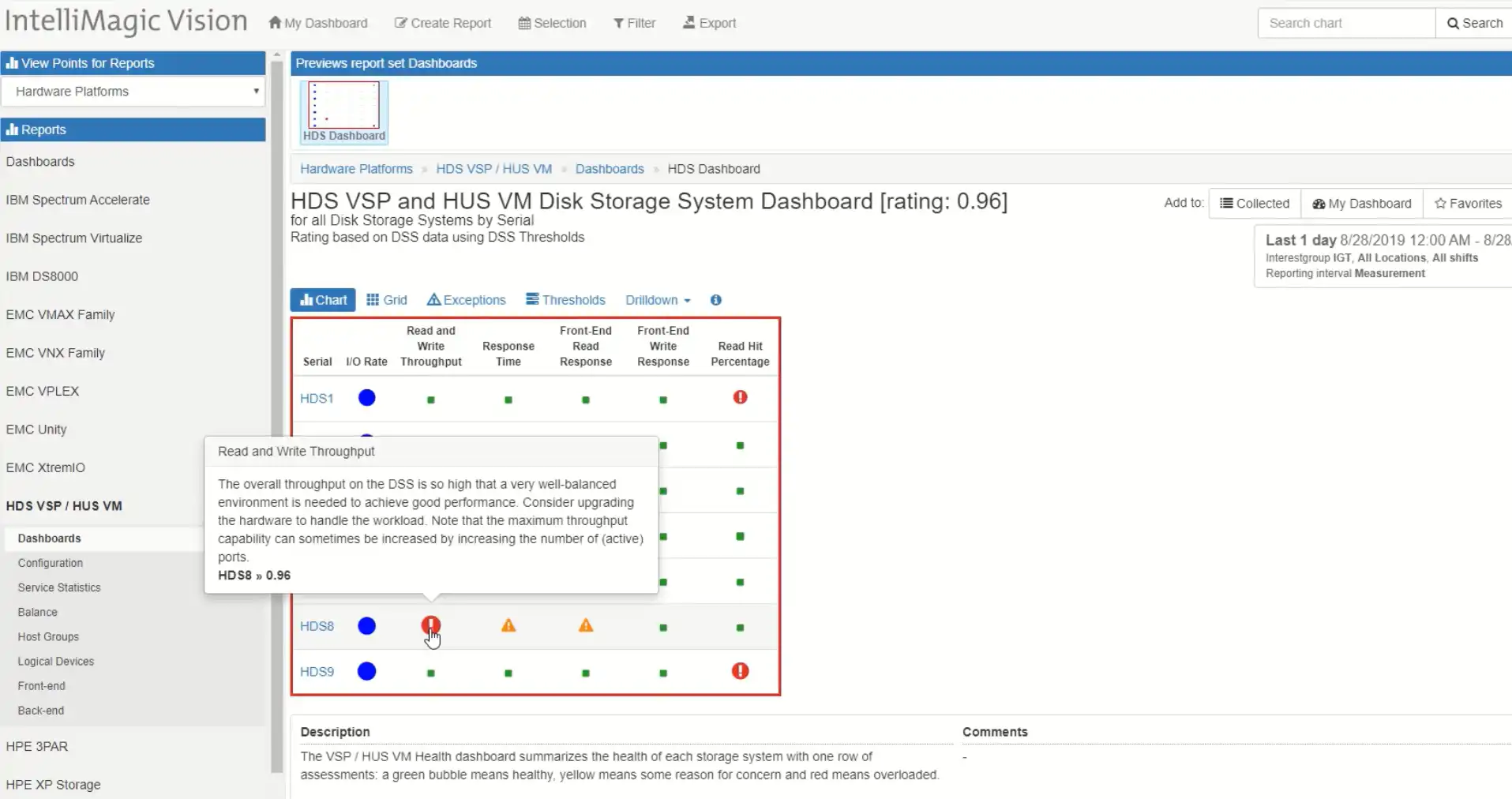
Ratings above 0.3 are indicative of too much time above the high watermark exception threshold. The ratings around that are yellow are indicating that we’re spending at least 10 percent of our time above the low watermark. In order to investigate further I simply click “Drilldown” and I see all the key performance indicators over time.
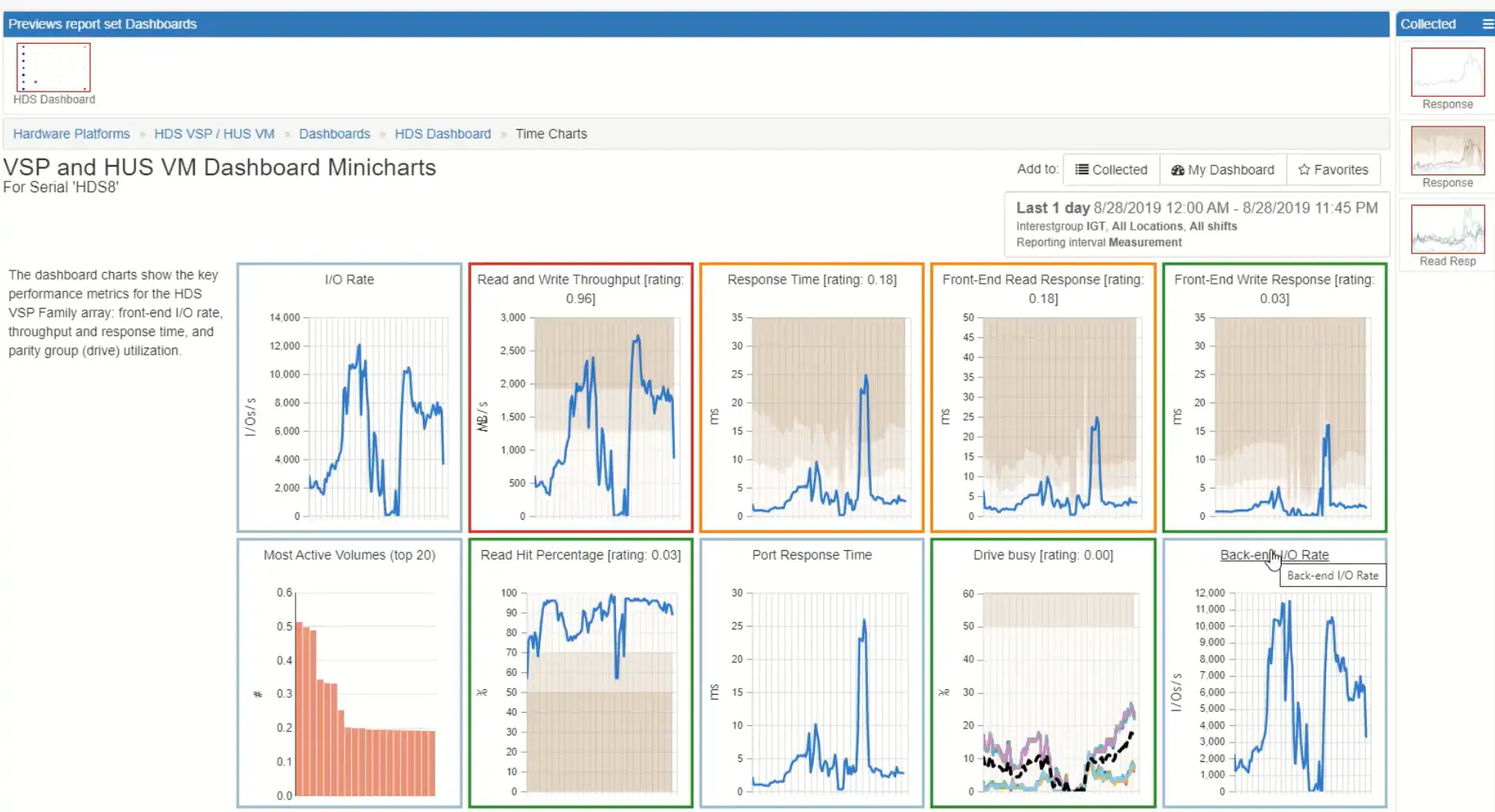
This is a great way to see if I have any correlations. In this view we have the overall throughput, the response times overall, the front-end read response time, the front-end write response time, the back-end I/O rate, the average drive busy, the port responses time and the cache read hit ration. I can see, in just one glance, the health of my systems. There are two spikes on throughput, two spikes on back-end but only one on the different response times and one on the port response time. This indicates that the second spike is the one in which there was a system constraint I can tell that the back-end drives are busy, but not that busy: they’re rated green. That’s why I can tell that my issue here is on the front-end and that front-end constraint is driving the front-end response time peaks. I can drill into that with just a couple clicks. I’m going to drill into the ports.
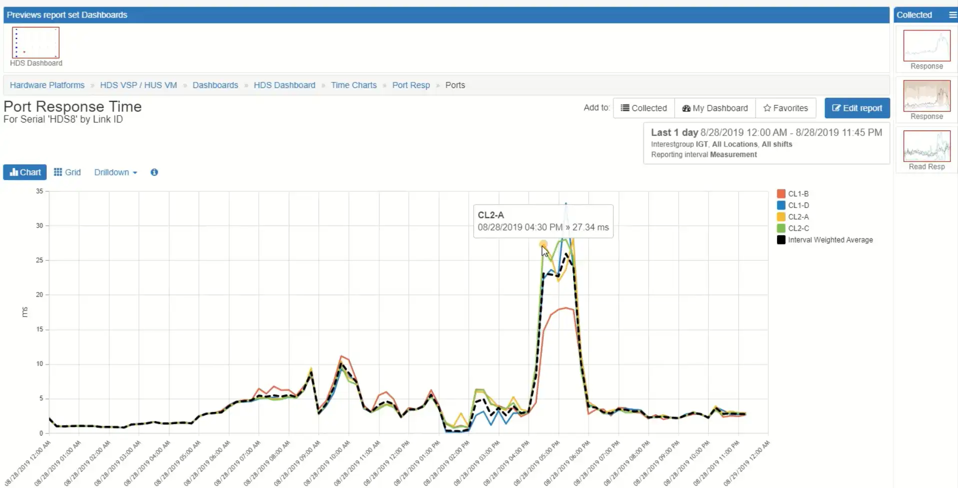
I see that all four ports are evenly experiencing poor high response time. Then I can drill into that and see more information about the link and see information about which host group is associated with those, so I know exactly who is driving the load. I can drill down further and see more information about which volumes and how the volumes are connected.
That was an overview of just doing a real quick root cause analysis using our health systems storage insight. Now we also have a configuration capacity and there’s history here if I want to look at history or look at more detailed information. I’ve got my hosts listed here so I can look at all the hosts for the different systems. We also have some different views on basically SLA views that you can define overall for response times, port utilization or back-end drive utilization.
We also have some excellent views to show you how well-balanced the system is. I want to look maybe at this HDS7, look at its ports.
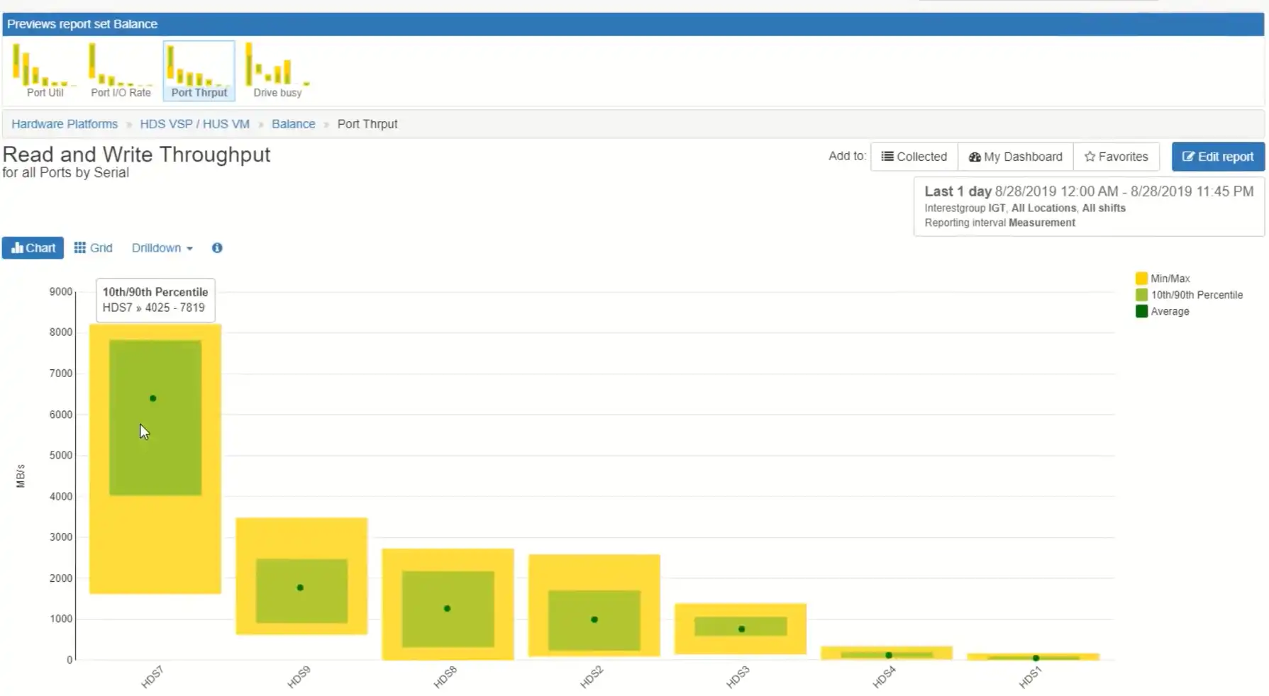
The green dot is indicating the average throughput for the link, the green rectangle is the 10th and 90th percentile and the yellow rectangle is the minimum and maximum value. In this statistical view you can see how things are balanced across the ports. You can see that one port has more workload than the others. This indicates that some of the hosts multipathing is not working right. I would want to drill down on that port to see which hosts are on it and then validate that their multi-pathing is configured correctly.
Related Resources
How to Detect and Resolve “State in Doubt” Errors
IntelliMagic Vision helps reduce the visibility gaps and improves availability by providing deep insights, practical drill downs and specialized domain knowledge for your SAN environment.
Finding Hidden Time Bombs in Your VMware Connectivity
Seeing real end-to-end risks from the VMware guest through the SAN fabric to the Storage LUN is difficult, leading to many SAN Connectivity issues.
Platform-Specific Views: Vendor Neutral SAN Monitoring Part 2
Each distributed system platform has unique nuances. It's important for a solution to be capable of getting the detailed performance data capable of supporting vendor-specific architectures.
Request a Free Trial or Schedule a Demo Today
Discuss your technical or sales-related questions with our availability experts today