This blog was originally published on October 18, 2021.
With more and more customers moving to IBM’s Software Consumption (Previously Enterprise Consumption) solution within Tailored Fit Pricing (TFP), it may be time to revisit some of the old tried-and-true MSU tuning strategies. With Software Consumption, all MSUs contribute to your software bill, no matter when they are consumed. In the past, you probably focused on MSU usage during your peak 4HRA and didn’t worry too much about the rest. Now, paying more attention to MSUs at non-peak times literally “pays” in terms of saving real money.
In one sense, it’s déjà vu all over again. Performance analysts have always been focused on optimizing for peaks: peak 4HRA, and peak intervals that push the limits of physical hardware. The overall approach is still the same, but now we also care about unnecessary consumption off-peak. This means we have a lot more to look at, and a lot more opportunity for savings.
At the same time, new members with less tuning experience are joining our teams. It’s a good time to revisit processes, tools, and skills to be sure you’re optimizing as much as possible.
In this blog, I’ll remind you of a simple yet powerful approach to identify workload increases quickly. Remember, the sooner you spot them, the sooner you can remediate the issue and save money.
How to Triage MSU Consumption Changes
They say a picture is worth a thousand words. Figure 1 shows MSU consumption by Workload, for the same system, for two different days. Do you see anything different?
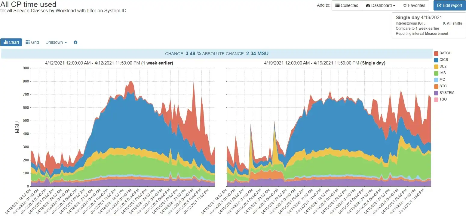
Figure 1: 24-hour Workload comparison for system SYSA_LI
There are several differences in the chart on the right. In particular, the STC workload increased for several hours in the morning, and the IMS workload increased late in the day. Notice that you didn’t have to take much time, or think a lot, or crunch any numbers to get the big picture quickly.
Humans are a visual species, and we’re pretty good at pattern recognition. You’re probably already thinking things like:
- The STC increase is about 50 MSUs – not huge, but worth looking into…
- STC went back down, so they probably already took some action – we just want to make sure it stays fixed…
- The IMS increase is bigger, and hasn’t dropped yet – better check on that one first…
- Everything else looks pretty much the same – probably no other follow up needed on SYSA…
- Is this my 2nd cup of coffee or my 3rd…?
Now that we’ve completed SYSA’s triage-at-a-glance, let’s investigate the IMS workload increase to see what’s going on.
IMS Workload Increase Root Cause Analysis
Drilling down to the region level, we see a clear picture in Figure 2.
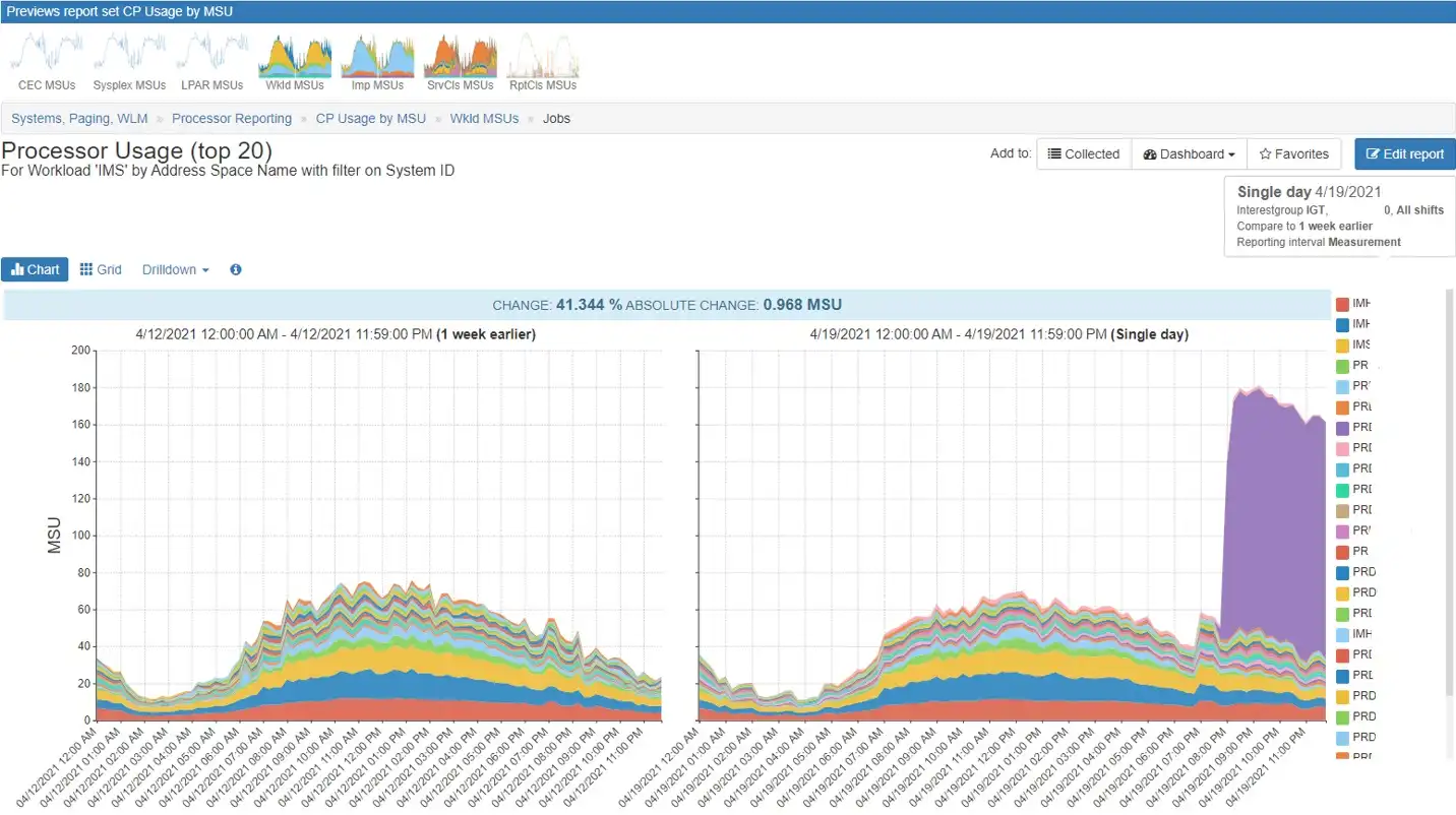
Figure 2: IMS address spaces
One region stands out with a dramatic increase beginning at 8:00pm.
It’s easy to see that this is not typical by reviewing a longer timeframe. Figure 3 shows the service class utilization for these regions for the prior month. Notice the spike on 4/19 – clearly this is not typical.
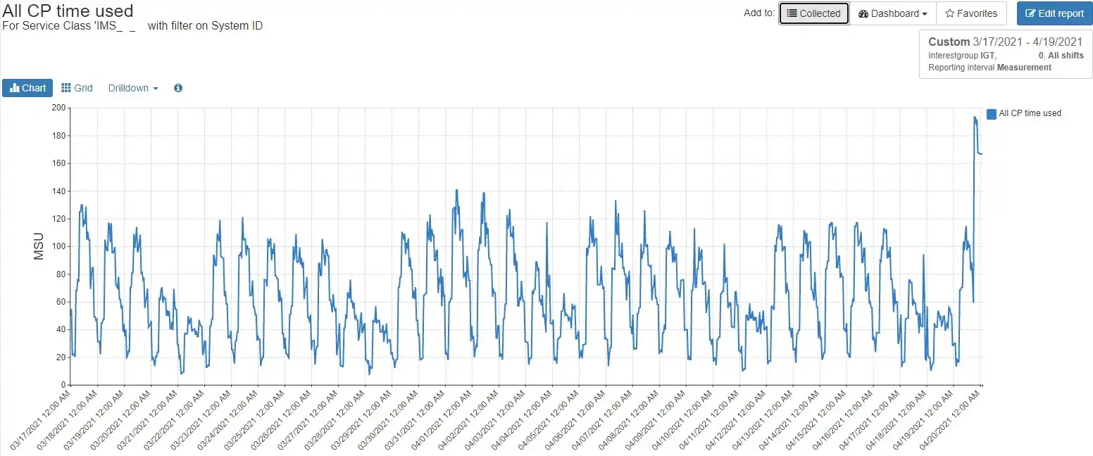
Figure 3: Prior month view confirms outlier
You can perform further due diligence, reviewing prior months’ data as well as plotting transaction rates vs. CPU consumption. Once you’re satisfied this increase is not business-as-usual, it’s time to ask the IMS team to investigate.
The point of this exercise was to quickly identify an increase that could consume MSUs if left unchecked, and you’ve done that.
STC Increase Root Cause Analysis
Figure 1 also showed an increase in workload STC. Let’s drill down to the address space level there as well, as shown in Figure 4.
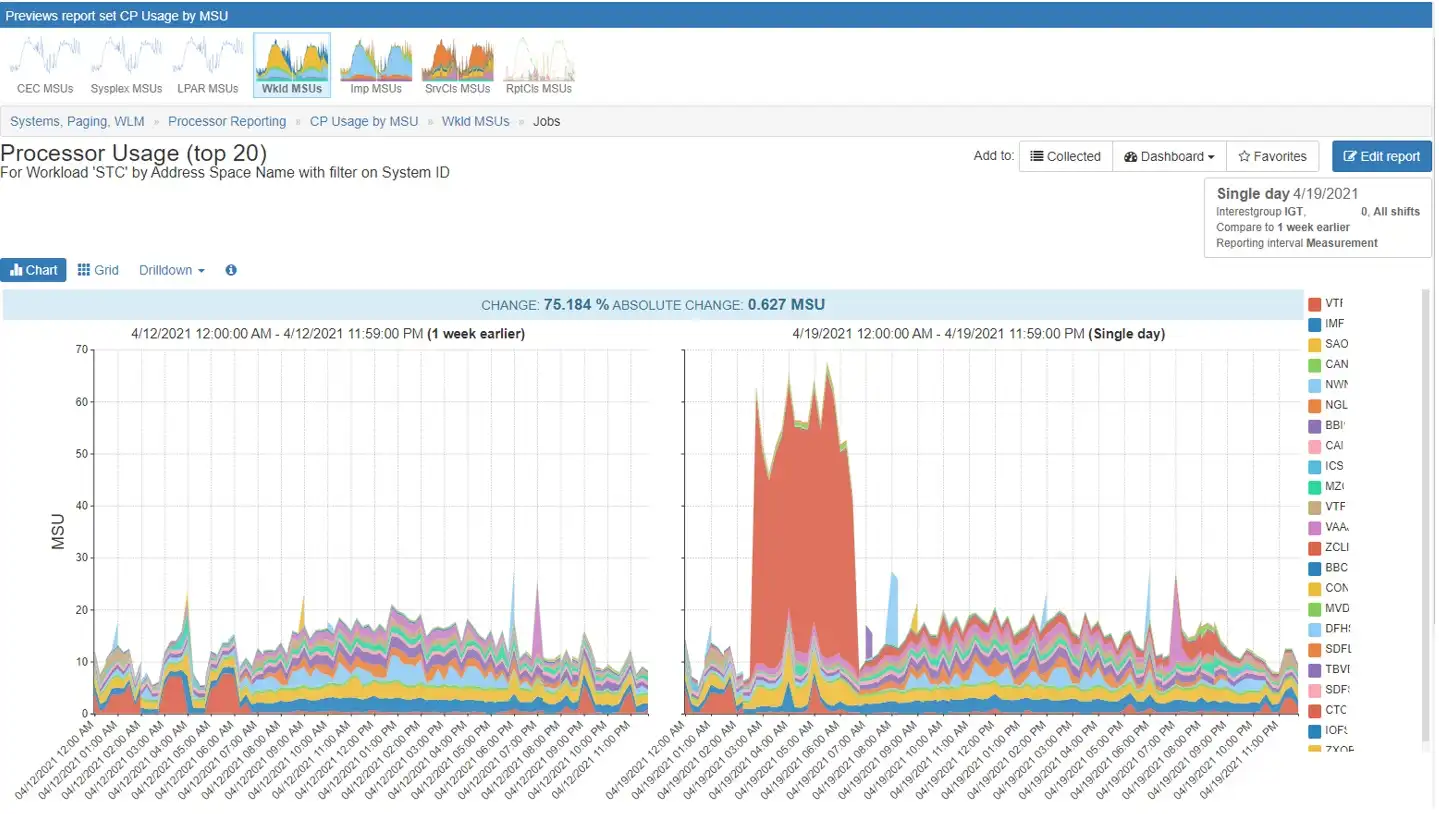
Figure 4: STC workload by address space
Figure 4 shows a spike of about 50 MSUs for a single address space. As with the IMS example, due diligence would show that this is not typical and not expected. Informing the appropriate team about this spike will help them investigate and remediate the issue before it happens again, in the spirit of preventing wasted MSUs.
Figure 5 shows another way you can compare CPU consumption from one day to another, for the top 20 address spaces. I like to do a quick check both ways, since some issues may be easier to spot in one format vs. another. For me however, the intuitive ease-of-use of the area charts is hard to beat.
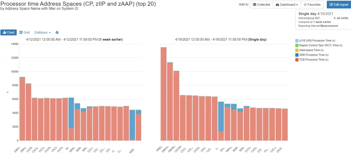
Figure 5: Comparison of daily CPU time for top 20 address spaces
Tip: At IntelliMagic, our consultants review charts like these as one element of proactive performance reviews. We typically do a daily review comparing a current day vs. one week ago. We compare Monday to Monday, Tuesday to Tuesday, etc., so that business workload patterns are comparable. We adjust for anomalies such as month-end or holidays and follow the data as needed, but comparing to the same day one week ago is a great place to start.
Utilizing New Ways to Reduce CPU
Looking for ways to reduce CPU consumption is nothing new. In fact, you could say this was considered more critical decades ago, when processor hardware was by far the most expensive component. With TFP, we are now circling back.
So, what is new? Off-peak savings matter, we have a new generation of performance analysts, and new ways to report the data. Visual comparison of CPU utilization at the workload/service class/report class/address space level is a tried-and-true approach that still applies. Leverage the power of visualization, and drill down for more detail.
There are many ways to trim MSU consumption, including those discussed in the tuning articles you’ll find here at IntelliMagic. Use them all to optimize as much as possible. Then repeat, because we all know that things change. It’s Déjà vu all over again
Reporting on Tailored Fit Pricing's Software Consumption
Discover ways to track your MSU consumption, and how to identify and investigate situations where your actual consumption is out of line with the expected consumption.
This article's author
Share this blog
You May Also Be Interested In:
Mainframe Cost Savings Part 3: Address Space Opportunities
This final blog in the mainframe cost reduction series will cover potential CPU reduction opportunities that produce benefits applicable to a specific address space or application.
Mainframe Cost Savings Part 2: 4HRA, zIIP Overflow, XCF, and Db2 Memory
This blog covers several CPU reduction areas, including, moving work outside the monthly peak R4HA interval, reducing zIIP overflow, reducing XCF volumes, and leveraging Db2 memory to reduce I/Os.
Mainframe Cost Savings: Infrastructure Opportunities Part 1: Processor Cache
CPU optimization opportunities applicable across the infrastructure can often by implemented without the involvement of application teams and can benefit a significant portion (or all) of the work across the system.
Book a Demo or Connect With an Expert
Discuss your technical or sales-related questions with our mainframe experts today

 Dennis Moore