What’s New with IntelliMagic Vision for z/OS? 2024.2
This month we’re introducing changes to the presentation of Db2, CICS, and MQ variables from rates to counts, updates to Key Processor Configuration, and the inclusion of new report sets for CICS Transaction Event Counts.
Let’s dive right into these changes:

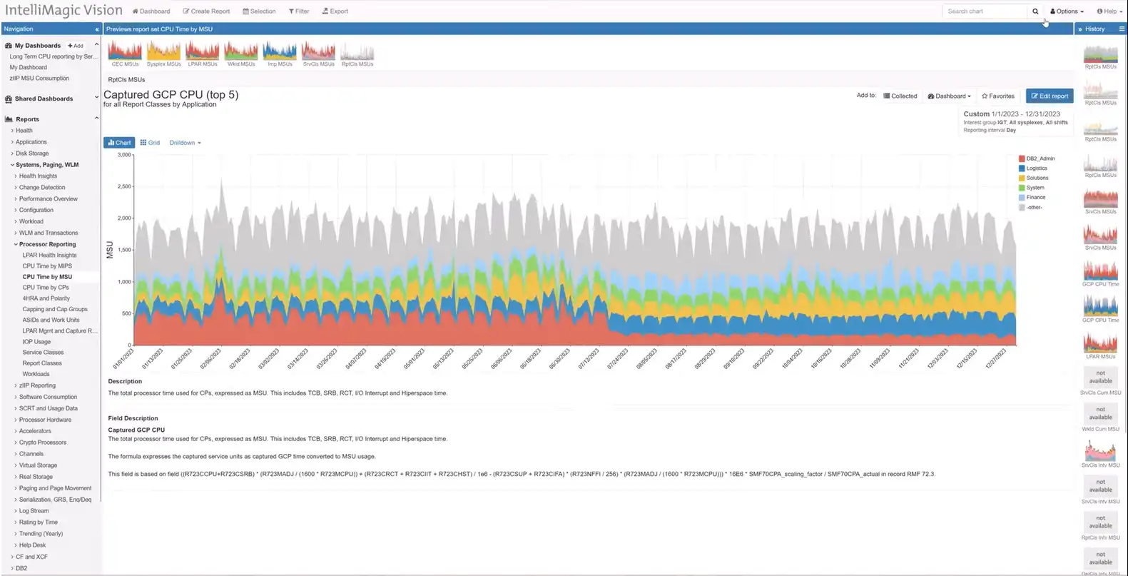
Ability to Change the Presentation of Db2/CICS/MQ Variables from Rates to Counts
IntelliMagic Vision 2024.2.0 provides a new option to change the presentation of Db2, CICS and MQ metrics from a rate to a count.
Analysts from various disciplines across the z/OS platform have traditionally had varying preferences on viewing their metrics as rates or counts. Disk and systems performance analysts have tended to prefer viewing their metrics as rates, simplifying comparisons of data coming from systems that might have different RMF interval settings. On the other hand, Db2 and CICS analysts have an established preference to view their metrics as counts.
Historically these differing approaches were not as apparent because analysts from various disciplines tended to use their own siloed tooling and had limited interaction with reporting from other disciplines. IntelliMagic Vision 2024.2 has removed the barriers inherent with siloed tooling by providing integrated visibility into metrics across the z/OS infrastructure, enabling greatly enhanced levels of cross-discipline analysis and collaboration across teams. IntelliMagic Vision now provides the capability for users to select whether they want to view eligible metrics as counts or rates.
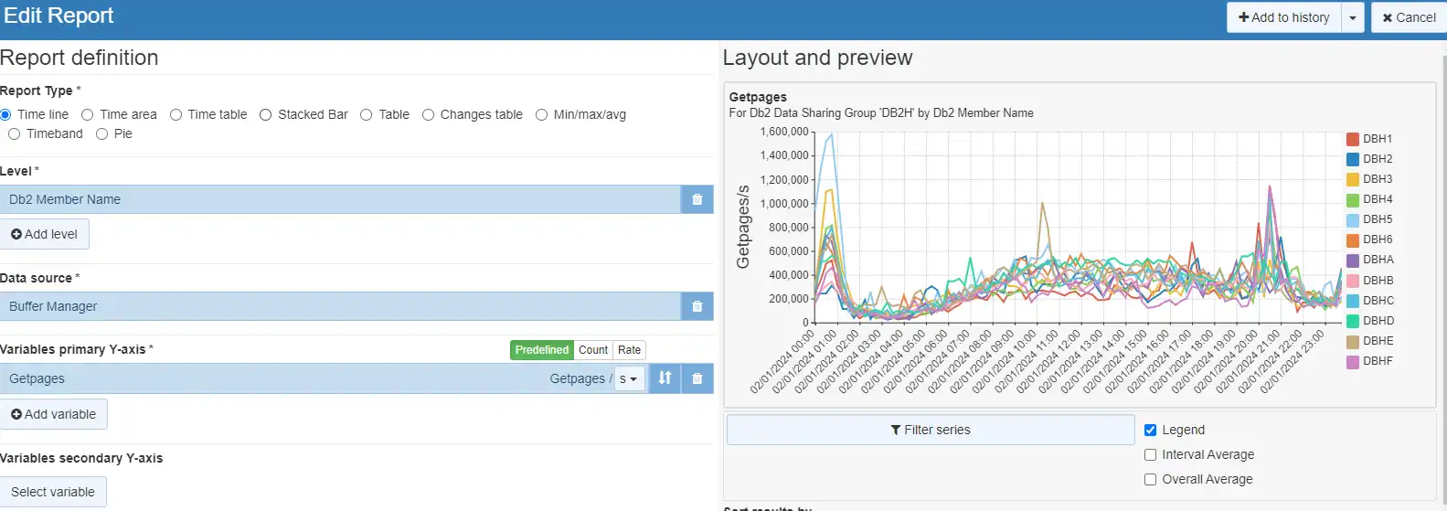 Any customized Count/Rate settings are saved with the report, so future invocations from a dashboard or “Collected” will retain the specified settings.
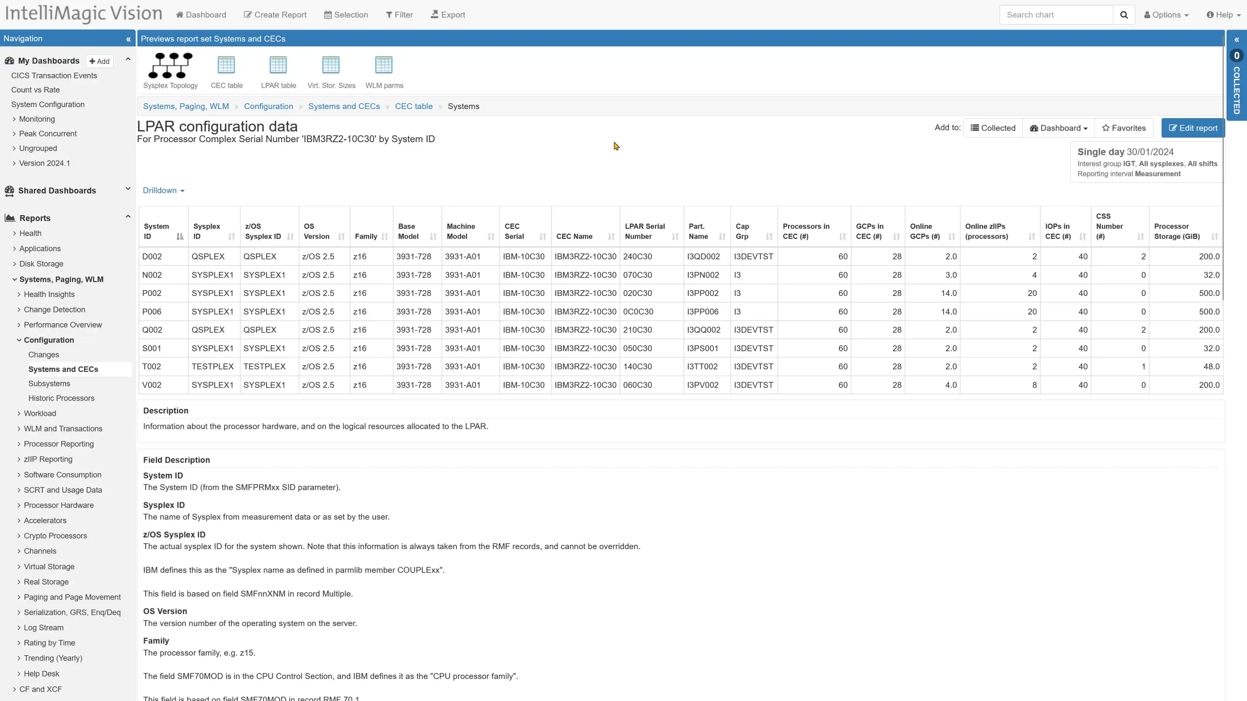
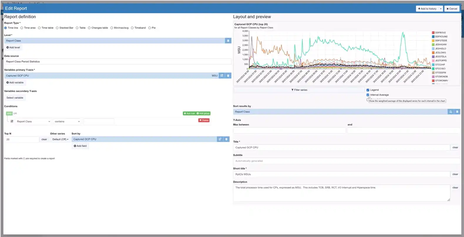
Key Processor Configuration
IntelliMagic Vision 2024.2 adds a direct drill down from the CEC configuration data to the configuration for each of the LPARs that run on the processor complex of interest. The system configuration marries important system and CEC configuration items.
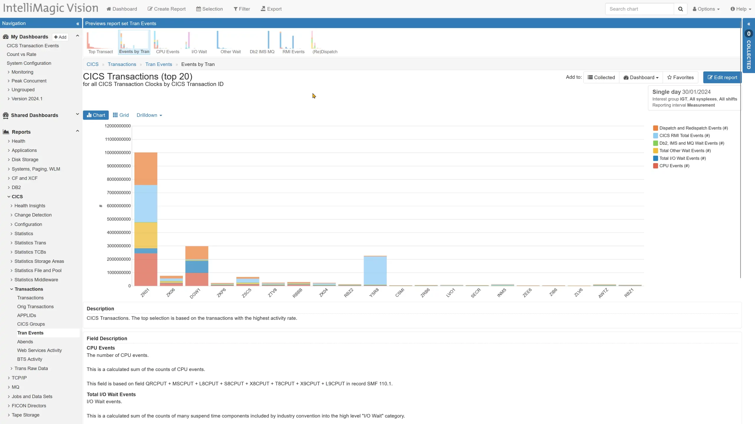
CICS Transaction Event Counts
The CICS transaction SMF 110.1 records combine timing information and event counts into what IBM describes as clock fields. IntelliMagic Vision 2024.2 two delivers a new CICS Tran Events report set with predefined reporting on the event counts along with drilldowns linking the events and timing-based data.
The report set is organized in a manner similar to the transactions report set.
Other Updates in 2024.2
To see the full list of releases and updates in IntelliMagic Vision 2024.2, please refer to the Release Notes.
If you have feedback or feature requests, reach out to your technical account owner or contact us here. You can also sign up for our newsletter to always stay up to date with the latest releases, tips, content, and events.
Stay tuned for more updates in the next release!
You Might Also Be Interested In:
Blog
Viewing Connections Between CICS Regions, Db2 Data Sharing Groups, and MQ Queue Managers
This blog emphasizes the importance of understanding connections in mainframe management, specifically focusing on CICS, Db2, and MQ.
Webinar
A Mainframe Roundtable: The Leaders | IntelliMagic zAcademy
Join industry leaders as they discuss the evolution of mainframes, sharing personal experiences, challenges, and future insights, along with practical advice from their careers in the Z ecosystem.
Webinar
Challenging the Skills Gap – The Next Generation Mainframers | IntelliMagic zAcademy
Hear from these young mainframe professionals on why they chose this career path and why they reject the notion that mainframes are obsolete.
Book a Demo or Connect With an Expert
Discuss your technical or sales-related questions with our mainframe experts today
Viewing Connections Between CICS Regions, Db2 Data Sharing Groups, and MQ Queue Managers

One key success factor in managing today’s mainframe environments is having a good handle on the multitude of connections between CICS regions, Db2 data sharing groups and members, and MQ queue managers. Having good visibility into these complex configurations can help CICS, Db2, and MQ performance analysts and administrators improve maintenance planning, optimize traffic, and shorten mean-time-to-resolution for many issues.
In this blog and subsequent video walkthrough, I’ll demonstrate one approach to visualize these connections by leveraging views that integrate data from multiple SMF data sources.
Using Subsystem Topology to View CICS, Db2, and MQ Connections
Figure 1 below shows a screenshot of the Subsystem Topology viewer within IntelliMagic Vision. We can see the connections between CICS and connected Db2 and MQ subsystems.

Figure 1: CICS, Db2, and MQ Subsystem Topology View
Orienting to this view, the CICS functionality that issues SQL calls to Db2 members and or MQ commands to MQ queue managers appears in the center of the view with the MQ queue managers along the top and the Db2 members and their associated data sharing groups along the bottom.
Since there are hundreds of CICS regions at many sites, this top-level view begins at the level of customer defined CICS groups, which typically reflect business applications.
Identify CICS Component Regions
From this initial view, one next step could be to expand a CICS group to identify its component regions. In Figure 2 below, the CICS group included five regions. We can also identify connections to four MQ queue managers along the top and four Db2 members that all belong to a single Data Sharing Group along the bottom.
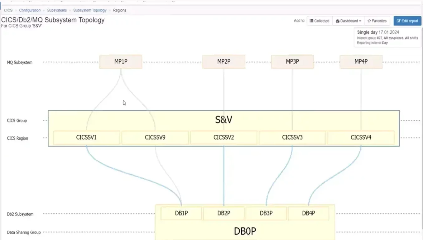
Figure 2: Isolating on a single CICS Group shows its regions and their MQ and Db2 connections
That same view for another CICS group, such as in Figure 3 below, involves a more complex set of relationships. It includes almost thirty CICS regions, but despite the fact these regions were grouped together from a business application perspective, we can see that they have very differing Db2 and MQ configuration profiles.
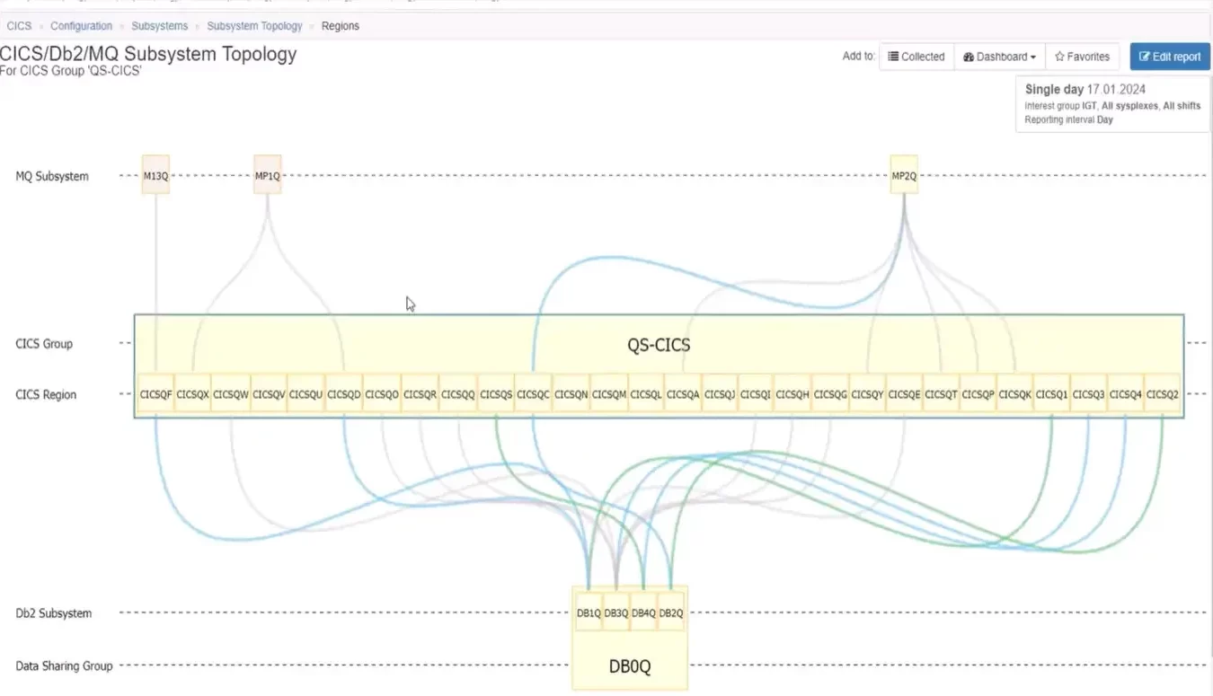
Figure 3: CICS Group with 30 Connections
This type of topology view clearly shows that some regions only have connections to a queue manager and not a Db2 member, while others have connections to a Db2 member, but not a queue manager. And some regions have connections to both MQ and Db2.
For groups that contain too many regions to have space to view all the region names, we can still gain overall insights into the configuration. In Figure 4 below it is apparent that all CICS regions that connect to Db2 do so to a single data sharing group, and there is general symmetry among most of the regions in this group to four primary MQ queue managers as seen along the top.
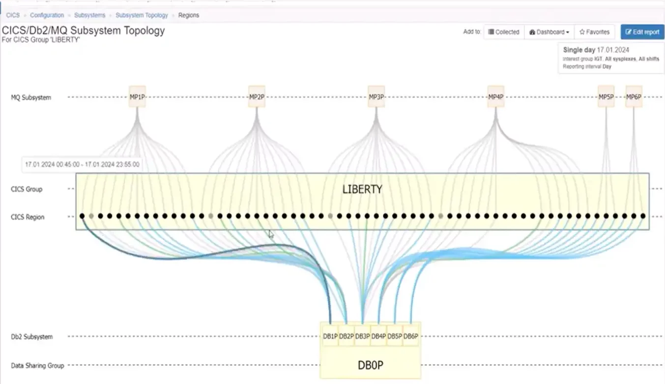
Figure 4: CICS Group with Over 60 Regions
Isolating Db2 Subsystem Views
So far we have approached the discussion from a CICS-centric point of view. Topology views can also be leveraged to create Db2-centric views, such as in Figure 5, which shows all the CICS groups that are connected to the selected data sharing group.
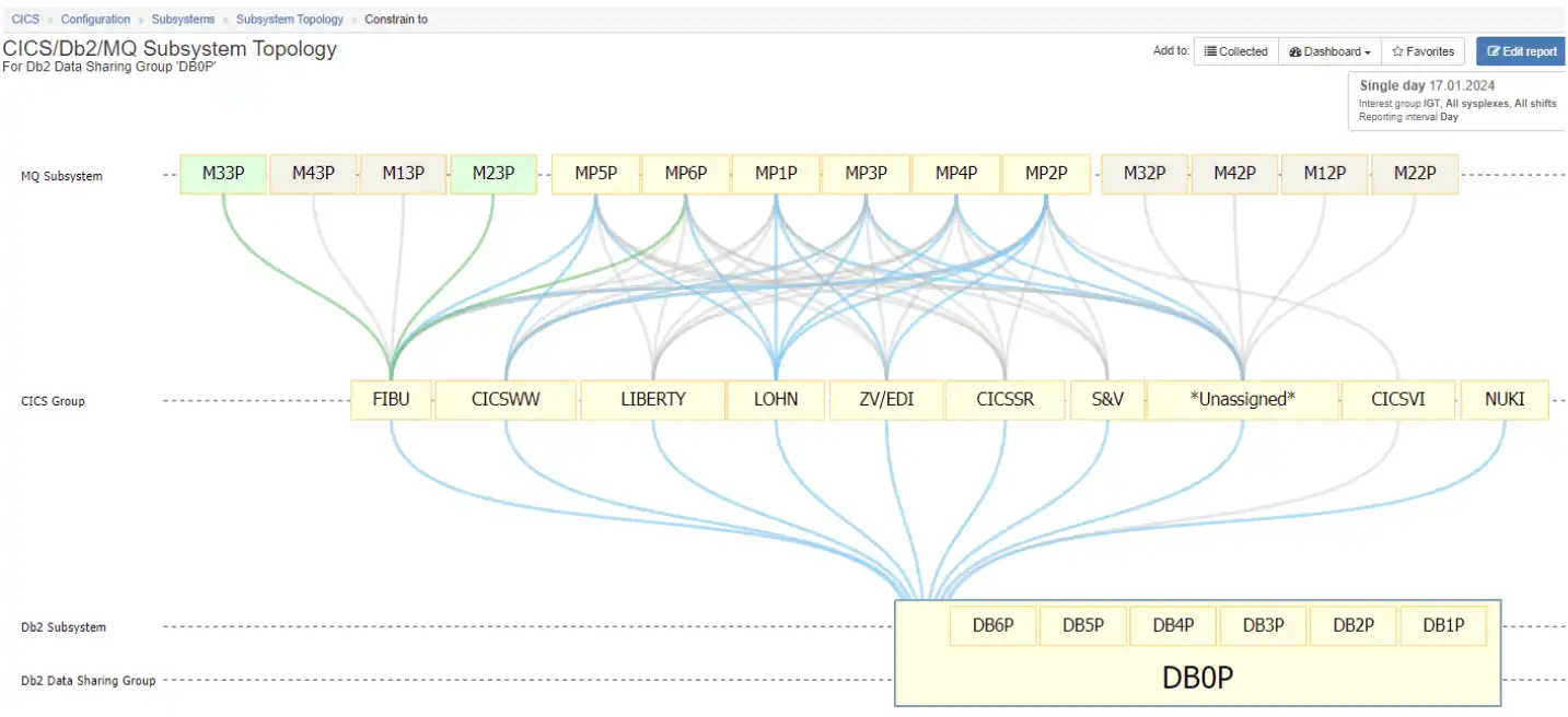
Figure 5: Db2-Centric View of Subsystem Topology Viewer
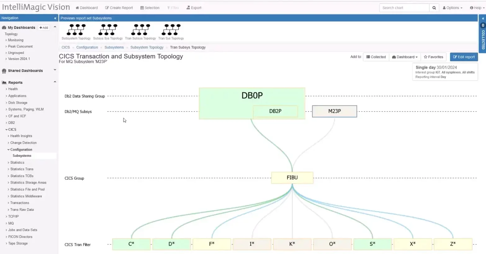
Isolating MQ Subsystem Views
MQ-centric views that show all the CICS groups that are connected to a particular MQ queue manager can also be helpful. Figure 6 surfaces a naming convention where almost all the CICS regions that connect with the selected queue manager have a “5” in their name. And the regions all connect to a Db2 member, which is also named with a five.
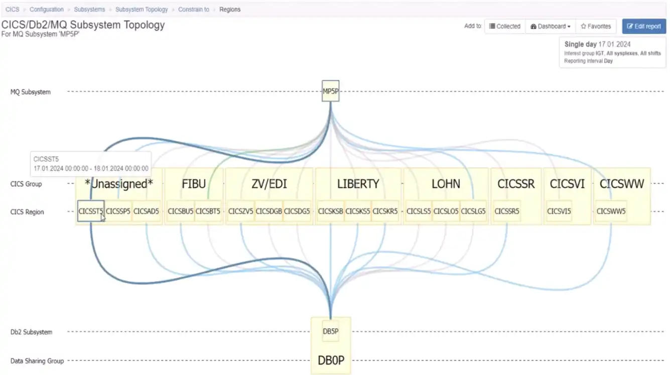
Figure 6: Topology Views Make it Easy to Identify and Isolate Naming Conventions
Subsystem Relationships with CECs and z/OS Systems
There can also be value in viewing relationships of CICS, Db2, and MQ in the context of their CEC and z/OS system relationships, as shown in Figure 7.
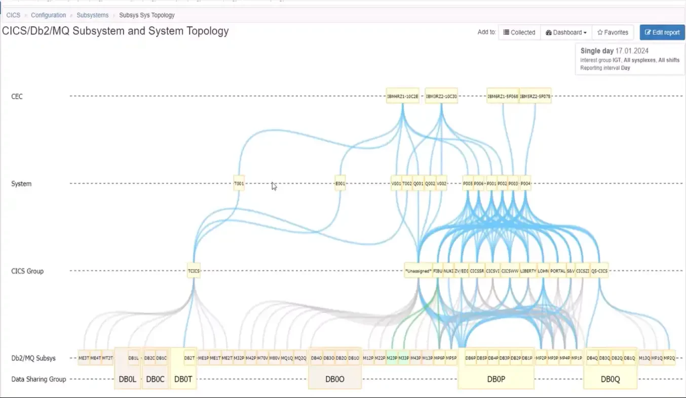
Figure 7: Viewing Subsystem Topology through CEC and System Relationships
Validate High Availability Design
Focusing the view on a selected CICS group, Figure 8 enables us to view the high availability design for that group. The four regions from this CICS group are distributed across four z/OS systems on four CECs.
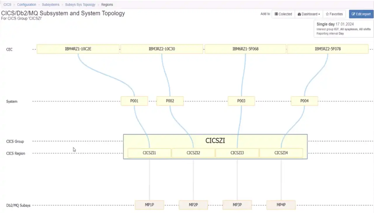
Figure 8: Topology Views Can Help Validate High Availability Design Objectives are Met
This view validates a configuration that is likely to deliver on the design objective that only about 25% of available capacity is ever lost no matter what component fails anywhere throughout the stack.
Examine Impact of Maintenance Downtime
Another common use case is to examine the scope of impact of downtime for maintenance on a given system. The view reflected in Figure 9 makes this immediately apparent for the system identified in the title.
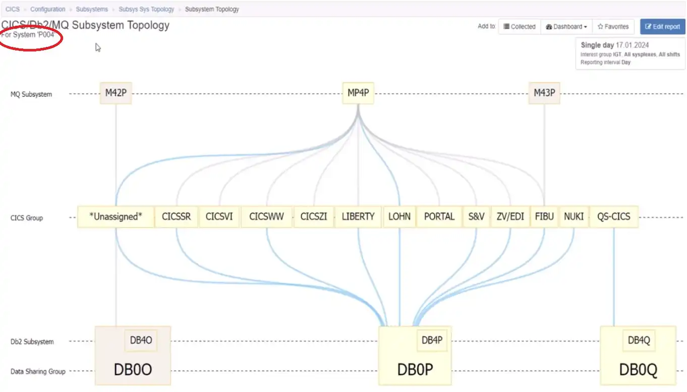
Figure 9: Topology Views Indicate Components that Would be Affected by System Downtime
From there, we could proceed to identify the CICS regions from one of the groups that would be impacted by scheduled downtime on that z/OS system.
Viewing CICS Transactions
The next step down the stack is to move from CICS groups and regions into transactions that are executing in a selected group, such as in Figure 10 below.
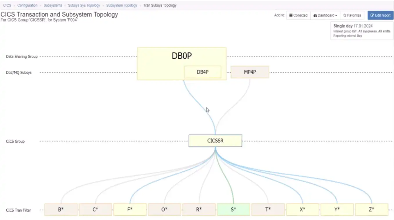
Figure 10: Identify Which CICS Transactions Execute in a Specific Group
Since we may expect this scope to include many distinct transaction IDs, this view begins by grouping the transactions by the first letter of the ID. From here we might want to expand that to the transaction IDs that begin with “X”, as seen in Figure 11 below.
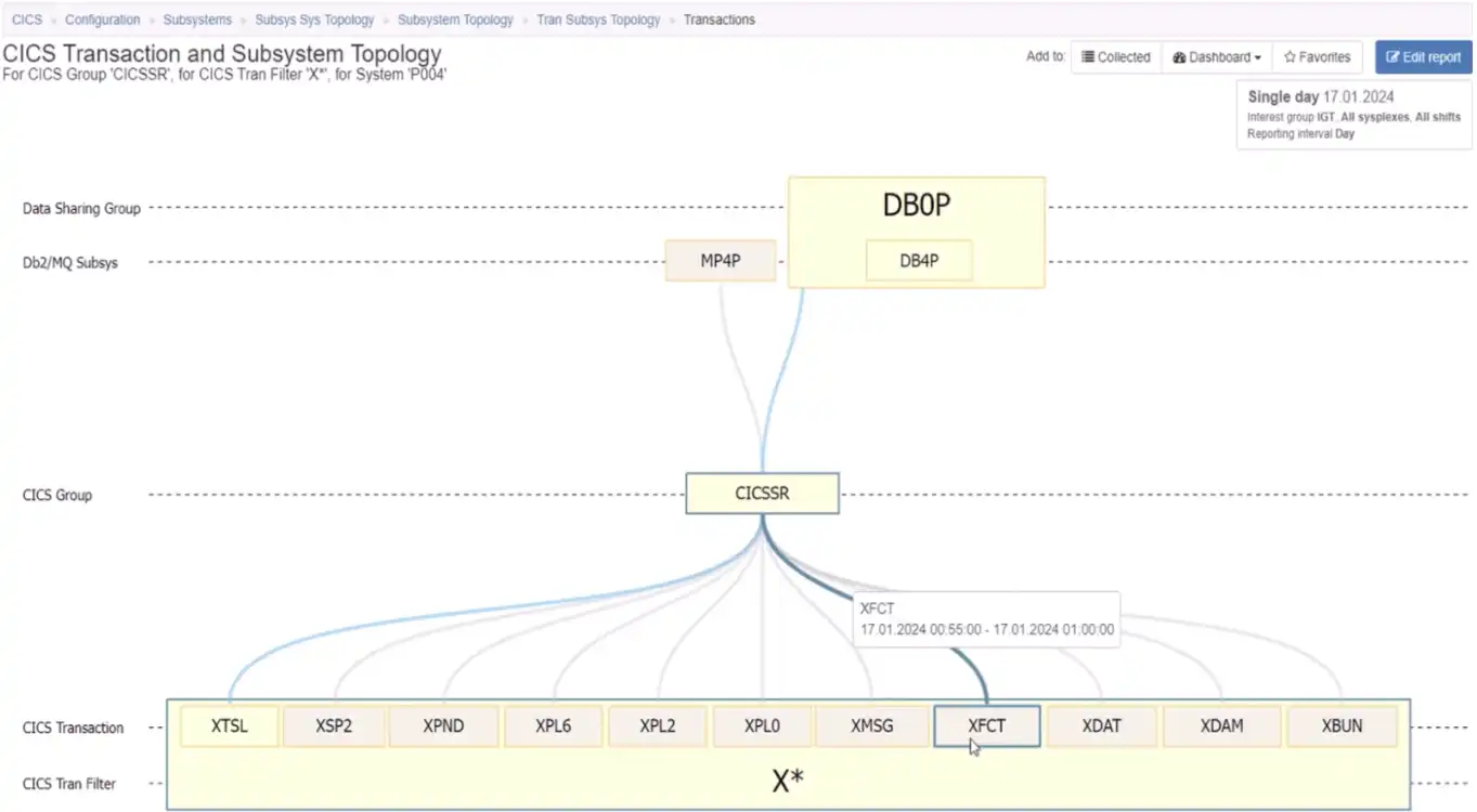
Figure 11: Isolating CICS Transactions that Begin with the Letter “X”
From there, we could expand the group and identify the CICS region, the Db2 member and the MQ queue manager that support the selected transaction on this selected system seen in Figure 12 below.
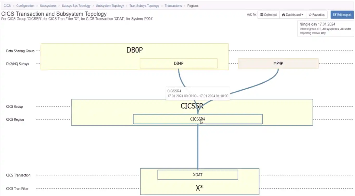
Figure 12: Visualizing the Full Stack Connections of a Specific CICS Transaction
From here we might choose to remove the system constraint and view the topology for this transaction as it executes across many regions in the group, along with their associated Db2 members and MQ queue managers.
Subsystem Topology Views Enable Faster Analysis and Understanding
Far from the days of manually taping topology views onto a wall to view subsystem connections, interactive Topology Views such as those in IntelliMagic Vision for z/OS offer analysts a wide array of views enhancing understanding of their system and subsystem configurations.
This ultimately enables us to:
- visualize the connections between CICS regions and associated Db2 and MQ subsystems
- visualize the relationships with supporting CECs and z/OS systems
- provide specifics down to the CICS transaction ID level
The video below demonstrates the z/OS Subsystem Topology Viewer in action. Feel free to contact one of our experts to set up a custom demonstration for your site. Or continue exploring with resources below.
This article's author

Share this blog
You May Also Be Interested In:
Blog
Viewing Connections Between CICS Regions, Db2 Data Sharing Groups, and MQ Queue Managers
This blog emphasizes the importance of understanding connections in mainframe management, specifically focusing on CICS, Db2, and MQ.
Webinar
A Mainframe Roundtable: The Leaders | IntelliMagic zAcademy
Join industry leaders as they discuss the evolution of mainframes, sharing personal experiences, challenges, and future insights, along with practical advice from their careers in the Z ecosystem.
Webinar
Challenging the Skills Gap – The Next Generation Mainframers | IntelliMagic zAcademy
Hear from these young mainframe professionals on why they chose this career path and why they reject the notion that mainframes are obsolete.
Book a Demo or Connect With an Expert
Discuss your technical or sales-related questions with our mainframe experts today
What’s New with IntelliMagic Vision for z/OS? 2024.1
This month we’re introducing updates to the Subsystem Topology Viewer, new Long-term MSU/MIPS Reporting, updates to ZPARM settings and Average Line Configurations, as well as updates to TCP/IP Communications reports.
Let’s dive right into these changes:
Subsystem Topology Reports
IntelliMagic Vision 2024.01 introduces major updates to the Subsystem Topology Viewer, offering enhanced insights into the interactions between CICS, Db2, and MQ.
With the inclusion of CICS Transaction IDs in reports, users can now identify the specific transactions linked to Db2 Data Sharing Groups and MQ queue managers. Drilldowns to CICS Regions are also available, enabling a comprehensive understanding of system dynamics. Whether troubleshooting issues with an MQ subsystem or exploring dependencies on Db2 Data Sharing Groups, the Subsystem Topology reports provide invaluable insights.
Long Term Reporting for MSU/MIPS Rates
Responding to customer requests, we have added long-term reporting for MSU (Million Service Units) or MIPS (Million Instructions Per Second) rates for service classes, service class periods, report classes, workloads, and every combination thereof. Users who have configured Applications based on Report Classes can also get the same visibility from the application perspective.
This enhancement empowers users to analyze CPU usage trends over time and make more informed decisions. The flexibility to view rates at different levels ensures a comprehensive perspective on system performance.
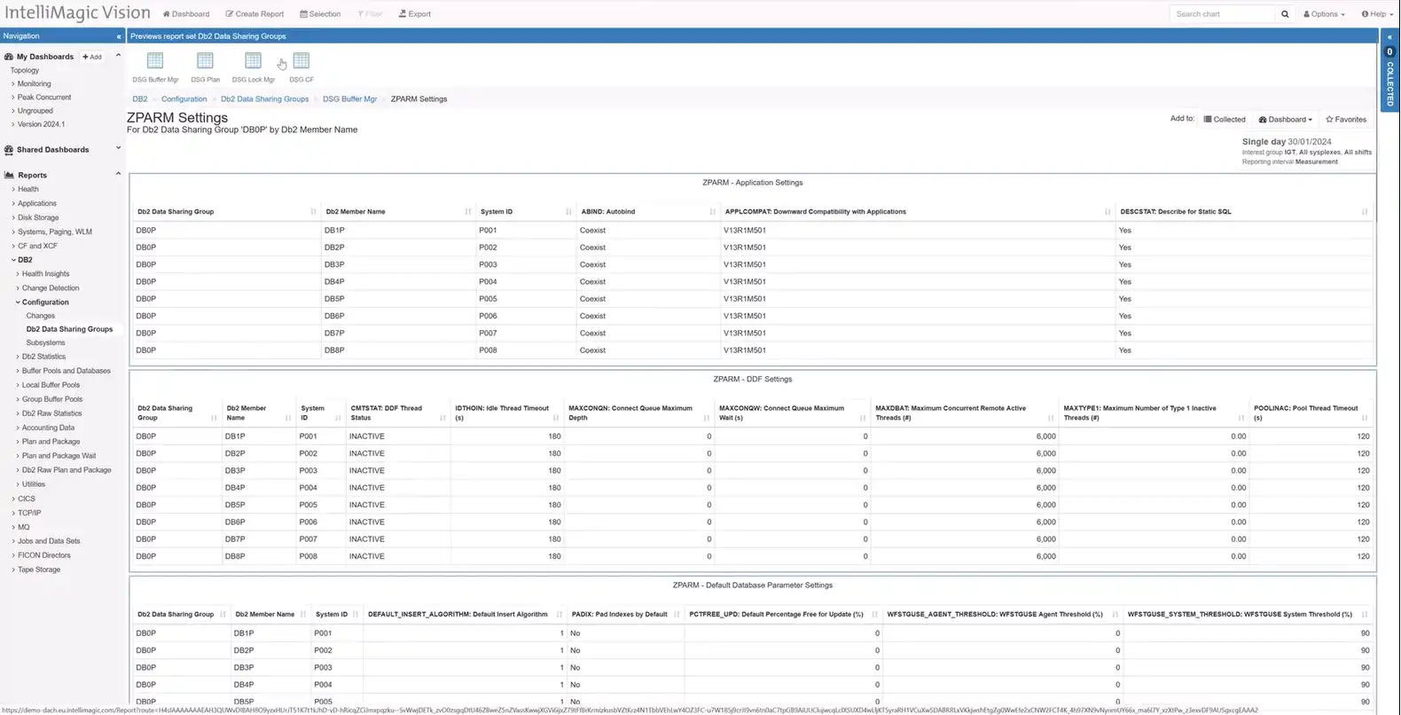
ZPARM Configurations for Db2
Managing Db2 configurations is made simpler with IntelliMagic Vision’s access to ZPARM settings. Users can easily navigate to ZPARM configurations from Db2 Data Sharing Groups, with focused reports on Buffer Manager Data, Plan Data, Lock Manager Stats, and Coupling Facility Structure.
The reports not only provide current settings but also offer change reports, aiding in tracking configuration modifications. Organized in logical reports, users can effortlessly access the information they need to manage Db2 effectively.
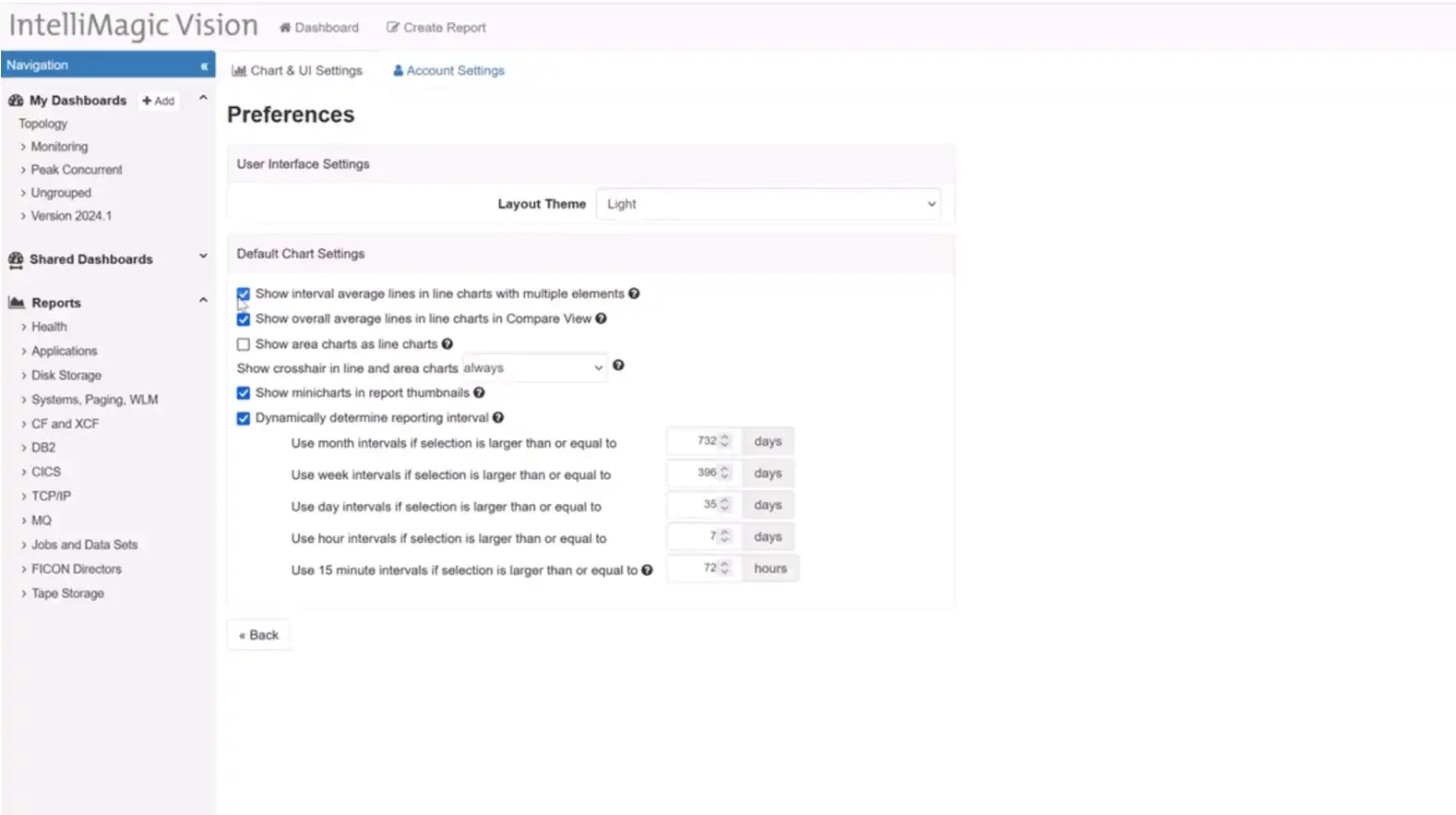
Interval Average Lines in Line Charts
IntelliMagic Vision 2024.01 introduces a change in our default settings based on user feedback. Now, new users will experience interval average lines turned off by default in line charts with multiple elements. This adjustment aligns with popular preferences, allowing users to choose when to display interval average lines, enhancing customization and user experience.
Enhancements in TCP/IP Communication Records
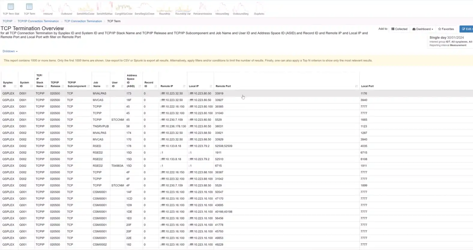
Validating security controls is made more robust with IntelliMagic Vision’s improvements in TCP/IP communication records. The SMF 119 subtype 12 records, widely used for security validation, are now complemented by an enhanced TCP Connection Termination report. This report showcases local and server IP addresses, server-side ports, and associated job names, facilitating easy identification of potentially risky port usage.
Other Updates in 2024.1
To see the full list of releases and updates in IntelliMagic Vision 2024.1, please refer to the Release Notes.
If you have feedback or feature requests, reach out to your technical account owner or contact us here. You can also sign up for our newsletter to always stay up to date with the latest releases, tips, content, and events.
Stay tuned for more updates in the next release!
You Might Also Be Interested In:
Blog
Viewing Connections Between CICS Regions, Db2 Data Sharing Groups, and MQ Queue Managers
This blog emphasizes the importance of understanding connections in mainframe management, specifically focusing on CICS, Db2, and MQ.
Webinar
A Mainframe Roundtable: The Leaders | IntelliMagic zAcademy
Join industry leaders as they discuss the evolution of mainframes, sharing personal experiences, challenges, and future insights, along with practical advice from their careers in the Z ecosystem.
Webinar
Challenging the Skills Gap – The Next Generation Mainframers | IntelliMagic zAcademy
Hear from these young mainframe professionals on why they chose this career path and why they reject the notion that mainframes are obsolete.
Book a Demo or Connect With an Expert
Discuss your technical or sales-related questions with our mainframe experts today
Top ‘IntelliMagic zAcademy’ Webinars of 2023

As year-end approaches I wanted to continue the tradition of looking back on the IntelliMagic zAcademy webinars that resonated most with our mainframe audience.
Since 2020, IntelliMagic zAcademy has offered free, educational z/OS webinars to the mainframe community. In 2023, we reached our 50th zAcademy webinar and covered topics from Mainframe Cost Savings to extracting insights from MQ data, mainframe security through zERT, application performance, and much more. But a top-5 countdown list can only have five.
The Top 5 IntelliMagic zAcademy webinars of 2023, as determined by total registration and attendance numbers, are:
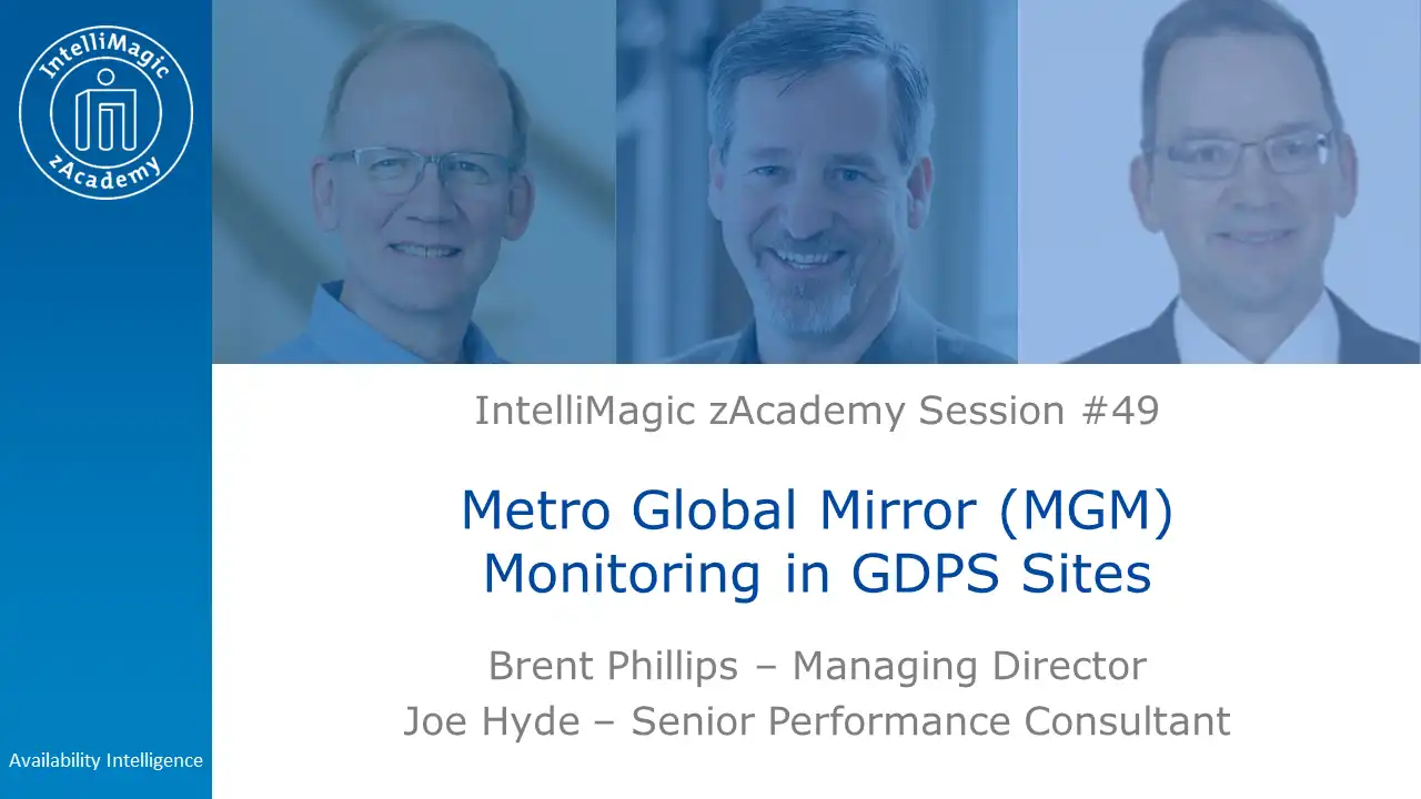
(Honorable Mention) Metro Global Mirror (MGM) Monitoring in GDPS Sites
Okay, I’m going to cheat just a little here. Just narrowly escaping the top 5, was this session where IBM legend Joe Hyde offered practical advice on monitoring the Recovery Point Objective (RPO) and the factors influencing it.
While GDPS automation provides local storage resiliency and remote failover capabilities, it is the customer’s responsibility to supply adequate hardware infrastructure aligned with their business needs, especially concerning data recency at the remote site in case of a failure.
By monitoring performance data, participants can gain assurance that business requirements are met and can proactively make changes if issues arise, ensuring a resilient and optimized IT infrastructure.
#5) How Mainframe Performance Teams are Solving Their Skills Gap Challenges
Kicking off the actual top 5 list is a webinar that covered a topic on everyone’s mind: the mainframe skills gap. In this webinar, Brent Phillips and Todd Havekost discussed how several mainframe sites are addressing the imminent retirement of experienced mainframe personnel.
This recording is highly recommended for any and all sites experiencing the skills gap or trying to proactively avoid it.

#4) Where Are All The Performance Analysts? – A Mainframe Roundtable
Launching our foray into the ’roundtable’ business, our 4th most attended session of the year was truly a meeting of the minds. With the likes of Martin Packer, Frank Kyne, Dave Hutton, and Jim Horne joining IntelliMagic’s own Todd Havekost and John Baker, these guys touched on everything performance – from costs, to labor, how to speak to management, AI, and much more.
Getting a group of experts like this on a single call is truly and honor and spectacle so if you haven’t already, I highly recommend viewing or listening to the recording.
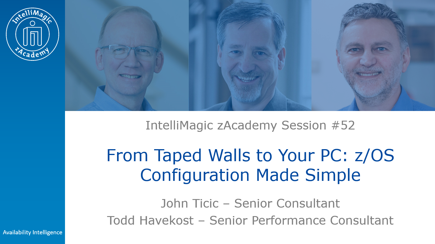
#3) From Taped Walls to Your PC: z/OS Configuration Made Simple
z/OS Performance and Configuration data is very useful for understanding complicated issues and solving problems, but sometimes it is hard to fully grasp what the data is showing us. Traditional methods of viewing and understanding our z/OS configuration often involved physically taping the mapped-out-topology to office walls – something not feasible or desirable in today’s massively complex environments.
In our third most viewed webinar of the year, John Ticic and Todd Havekost discussed and demonstrated a breakthrough new method of interpreting and interacting with the LPAR, FICON, and Sysplex topologies.
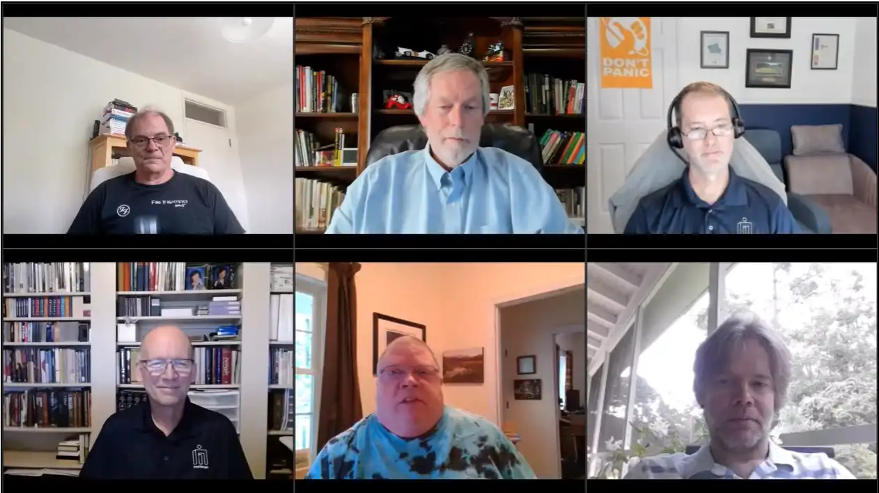
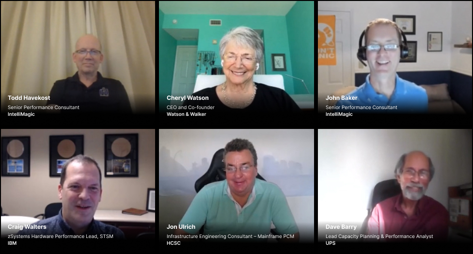
#2) Oh Where Performance Will Take You: A Mainframe Roundtable
Our second ever zAcademy Roundtable hosted the likes of Cheryl Watson and Craig Walters amongst a rockstar group of performance and capacity analysts. So there’s no surprise that this comes in at #2 on our list.
Moderated again by John Baker, this roundtable event explored the journey of several renown mainframe performance analysts and offered insights and perspectives on timeless topics.
Panelists included:
- Cheryl Watson, Watson & Walker
- Craig Walters, IBM
- Dave Barry, UPS
- Jon Ulrich, HCSC
- Todd Havekost, IntelliMagic
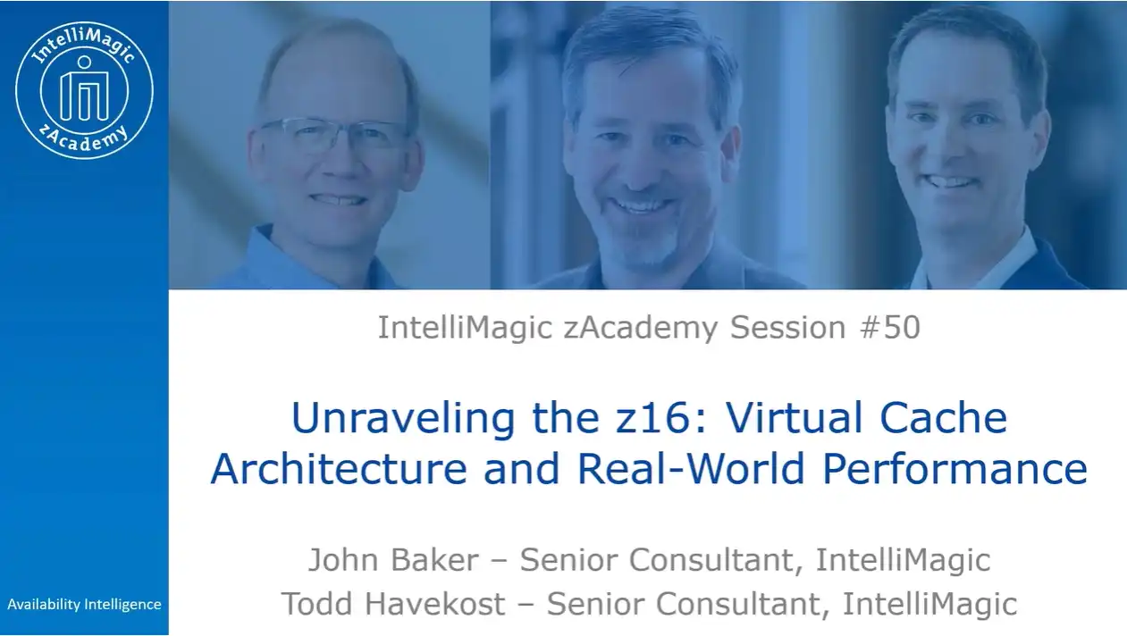
#1) Unraveling the z16: Understanding the Virtual Cache Architecture and Real-World Performance
By and far the #1 most viewed zAcademy session of 2023 (and all time) was this session presented by John Baker and Todd Havekost.
During this ground-breaking discussion, John and Todd discussed the revolutionary changes brought about by the z16 processor architecture, and walked through the results of numerous recent upgrade analysis’ with surprising results.
With the introduction of virtual cache at levels 2, 3, and 4, the z16 marks the most substantial transformation in the z processor architecture since the z13. For any site who is considering migrating to the z16 (or already has), this is truly a can’t miss session on what results you can likely expect and how you can verify you received (and are receiving) the expected results.
Looking Towards 2024
If you haven’t yet watched any of the live sessions or recordings of this year’s zAcademy sessions, or if you’re a super-learner that signs up for every session, remember that all zAcademy webinars and recordings – past and future – can be accessed at www.intellimagic.com/zacademy/
IntelliMagic zAcademy will continue into 2024 with exciting insights and deep dives into several new areas of the z/OS mainframe. If you have a favorite session you want to tell us about, have questions about any of the material you saw, or if you have a recommendation on a topic you want us to cover in the future, send us a note at info@intellimagic.com, and we’ll get back to you!
Thanks for watching – tune in next year!
This article's author

Share this blog
Related Resources
Blog
Viewing Connections Between CICS Regions, Db2 Data Sharing Groups, and MQ Queue Managers
This blog emphasizes the importance of understanding connections in mainframe management, specifically focusing on CICS, Db2, and MQ.
Webinar
A Mainframe Roundtable: The Leaders | IntelliMagic zAcademy
Join industry leaders as they discuss the evolution of mainframes, sharing personal experiences, challenges, and future insights, along with practical advice from their careers in the Z ecosystem.
Webinar
Challenging the Skills Gap – The Next Generation Mainframers | IntelliMagic zAcademy
Hear from these young mainframe professionals on why they chose this career path and why they reject the notion that mainframes are obsolete.
Book a Demo or Connect With an Expert
Discuss your technical or sales-related questions with our mainframe experts today
Banco do Brasil Ensures Availability for Billions of Daily Transactions with IntelliMagic Vision
Company Overview
Banco do Brasil, with over 87,000 employees, 5,000 branches, and 81 million customers, is one of the largest banks in the world, processing over 15 billion transactions per day. Headquartered in Brasilia, Brazil, Banco do Brasil provides commercial and government services as well as a large variety of consumer services, including bill payment services, ATM loans, and checking, savings, and investment accounts.
 > 87,000 employees > 87,000 employees |
 > 5,000 branches > 5,000 branches |
 > 81 millions of customers > 81 millions of customers |
 > 15 billion transaction per day > 15 billion transaction per day |
The Challenge
As the second largest financial services company in Latin America, Banco do Brasil has one of the largest and most complex IT infrastructure environments in the world. As a publicly owned bank with billions of daily transactions and millions of customers, there is no margin for system downtime or application disruptions.
Previous solutions to manage performance and conduct capacity planning were cumbersome, slow, required manual coding, and were not interactive or easy to train new hires on. They needed a solution that would allow them to keep up with modern demands, rising transactions, and expanding data volumes.
The Solution
For more than a decade, Banco do Brasil has used IntelliMagic Vision to monitor and manage the performance and availability of their entire end-to-end z/OS and SAN infrastructure environments.
“We use IntelliMagic Vision for z/OS on a daily basis to investigate bottlenecks and analyze performance problems. We also use IntelliMagic Vision for z/OS to improve our system and storage designs and better understand our environment. IntelliMagic Vision has been extremely helpful in post-mortem analysis.”
– Fabio Pereira, Banco do Brasil, Storage Manager
Banco do Brasil uses IntelliMagic Vision for z/OS Systems, CICS, Db2, Disk & Replication, Virtual Tape, as well as SAN Storage, Fabric, and VMware.
IntelliMagic Vision also met the organization’s core requirements with its:
- Built-in health insights to proactively avoid disruptions
- Extensive drill down capabilities
- Code free report builder
- Capacity Planning
- Intuitive graphical user interface
Business Results
IntelliMagic Vision enabled Banco do Brasil to streamline its performance management and capacity planning and enhance its overall business operations.
With IntelliMagic Vision, Banco do Brasil was able to:
- Proactively highlight and prevent potential availability issues
- Eliminate redundant tooling and use a single interface across infrastructure areas
- Reduce mean-time-to-resolution for problems
- Enhance communication and cooperation amongst different teams
To learn more about how Banco do Brasil uses IntelliMagic Vision, view the full review on TrustRadius.
Book a Demo or Connect With an Expert
Discuss your technical or sales-related questions with our mainframe experts today
How A Db2 Newbie Quickly Spotlights the Root Cause of a Db2 Slowdown

Leveraging Familiarity of Solution
I’ll be watching my grandkids closely this Summer as they jump in our backyard pool. The older ones have the confidence to jump off the diving board because they have learned to swim on their own and have been in the pool a few times. However, the younger ones are still approaching the whole experience with some real caution. I’m thankful for that. The main difference for them is experience-based confidence. This is a bit like performance analysts when we are approached with analysis of problems that may be outside our expertise or comfort zone.
A z/OS systems performance person has a high level understanding of the CICS, MQ, and Db2 subsystems, but when asked to find the root cause in something that looks like a Db2 delay, you may feel uncomfortable performing a deep dive into unfamiliar waters.
Fortunately, when recently asked by a customer during our monthly status update to look at a specific time frame to identify the culprit of a recent Db2 slowdown, I wasn’t afraid to take the dive because I had access to super powerful ‘performance goggles.’ There was only 5 minutes left in the call, and it was related to a subsystem, Db2, that I’m familiar with, but by no means an expert.
First Step: Approach the Problem
The questions: When, How long, What, …. were quickly answered by the customer as it related to the issue. Equipped with a couple of answers, an adhoc report is just a few clicks away with a modern Db2 performance solution.
Db2 has one of the most voluminous sets of SMF data available for z/OS subsystems. For most of our customers, it is easily equal to all of the other SMF data combined. Some Db2 customers generate one terabyte/day of compressed data.
The big split between statistics (SMF 100) and accounting (SMF 101) data gives two primary dimensions in which to focus your analysis. Starting down a statistics path first, visual cues of expert-selected metrics and thoughtful sets of reports (thumbnails) with subtitles helped me quickly navigate through the details.
I had a hunch that the description fit a potential lock wait or something along those lines. By the way, I don’t think I could define a latch wait from a lock wait accurately, but a wait is a delay, and I was interested in delays.
Choosing the IntelliMagic health insights report for locking and latching (seen in Figure 1) first helped focus the diagnosis since the customer representatives provided the additional benefit of seeing the visual cues with a screen share.
When a list of 20 data sharing groups showed up for a particular time frame, I could immediately focus on two or three hot spots, noted by the red exception bubbles, which aligned with the details provided. With solutions that only have a tabular view to review the data, it’s easy to miss something that should be standing out.
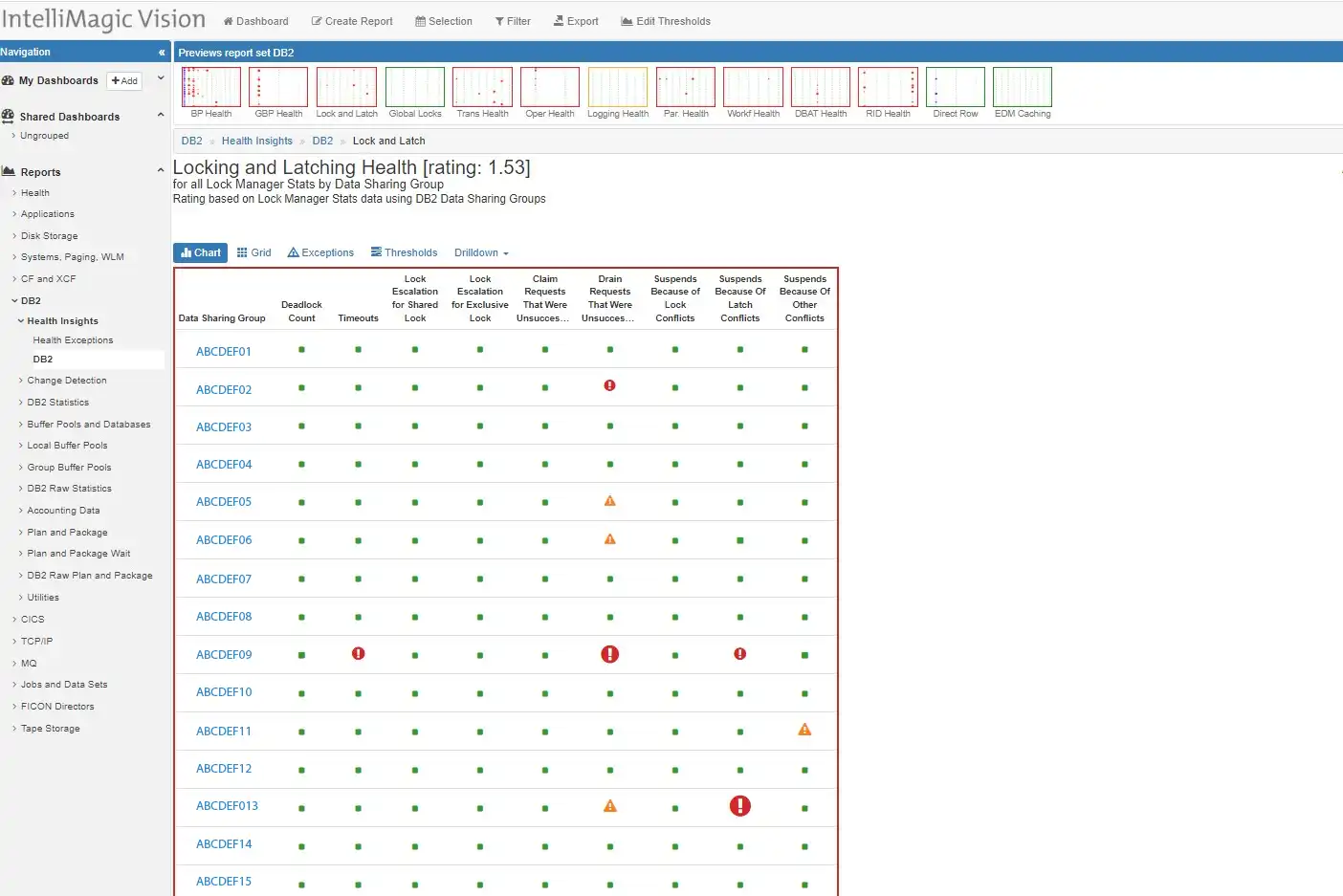
Figure 1: Finding the best path for quick analysis
Selecting drilling down into time frames, Sysplex, Systems, and further details, I was able to quickly focus the analysis from hundreds of options down to just a few. The highest rated Db2 infrastructure metric showed some stress for one particular data sharing group in the latch conflict suspends.
Both members of the data sharing group were impacted. Since we had little time left in the call, it was important to take a quick look at the details from the database application side, so I poked into the Db2 accounting data reports.
Application Orientation of Response Delays
Db2 accounting data has a number of dimensions to dive into. The statistics had me focused on latch suspends, so I chose to start with some Db2 transaction response times and compare them to last week. Again, the flexibility to navigate and control output greatly simplified the activity so that we could remain focused on what might be the cause of the delay.
The view that kept us on track showed a precipitous drop in the commit rate, and at the same time a heavy spike in response time. A 10-fold increase in a 15-minute average, at the time in question.
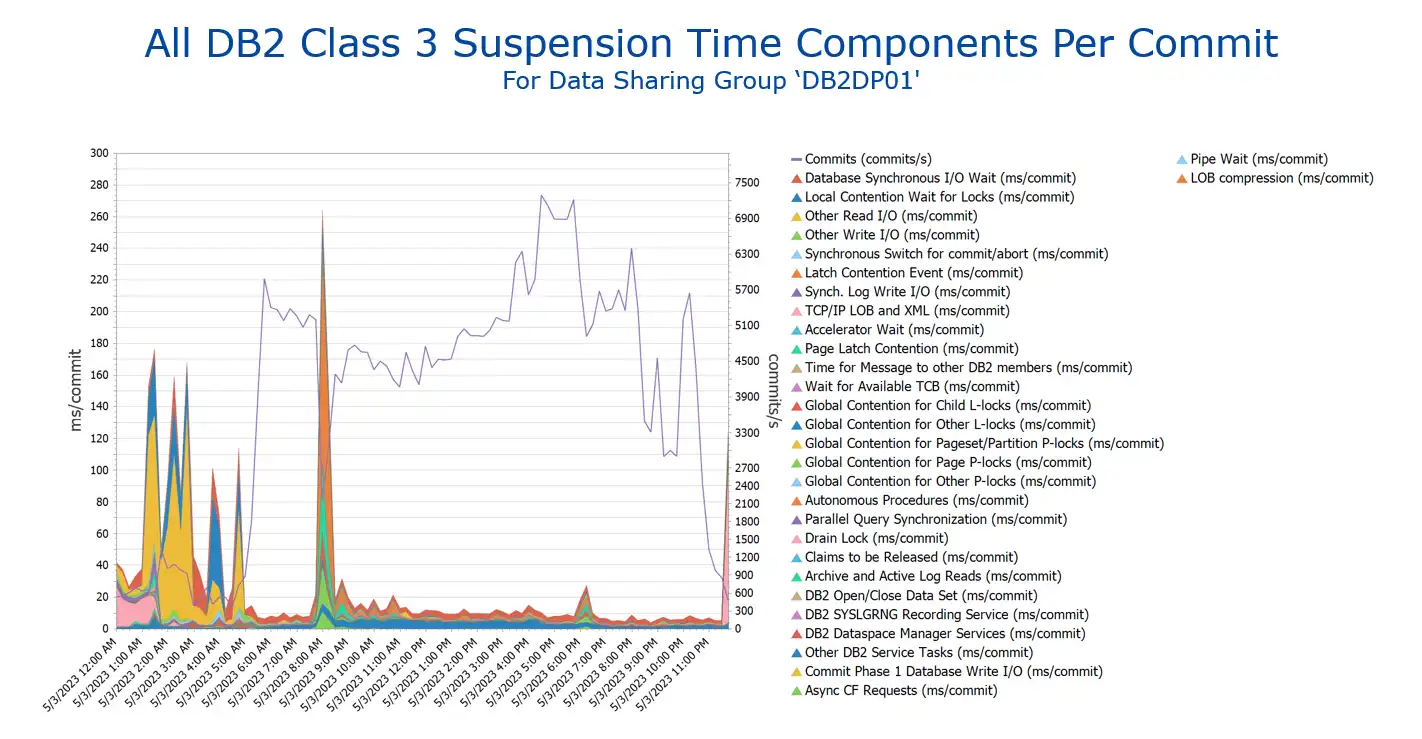
Figure 2: Commit Rate drops & Db2 Suspension times skyrocket
This was looking promising, so by having automatic options to drill into the last bit of details (and there are many) we could see that the latch contention – Data Sharing Index Split was the primary cause of delay (suspension) during the spike.
Quick navigation and easy to choose options helped me provide the customer quick identification of a major contributor to a problem that had already consumed many hours of time and analysis. Links to the reports and a short email after the call gave the customer some real evidence of delay causes to the post-mortem call that was happening in minutes.
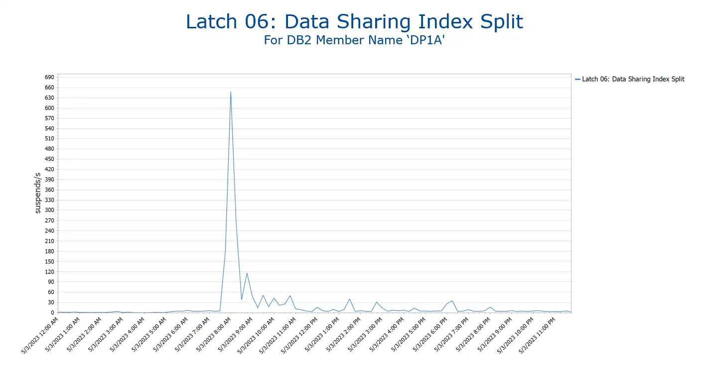
Figure 3: Honing in on the Primary Issue
Simplicity Searching the Complex
The complexity of Db2 normally requires serious experience to understand the details when looking into delays. However, having experience with an intuitive and intelligent analysis solution significantly improves the productivity of your analysis by offering good starting points, helpful filtering options, and easy navigation.
There are over 20 categories for Db2 class 3 suspend time; there are approximately 30 different categories of latch suspend time. Visualizing many of these together in one tabular report can quickly become overwhelming.
Solutions that provide separate reporting in thumbnails that can be quickly scanned visually (such as IntelliMagic Vision) are much more efficient. Good solutions make the investigation process easier, more approachable, and more productive for your team. This also provides more satisfying work for those doing the analysis.
I much prefer getting to a point where I can do research on what the index split latch suspend means than creating and combing through thousands of tabular reports looking for variances.
So… What is an Index Page Split?
Robert Catterall (IBM) has a nice blog on a very similar issue. He is a Db2 performance expert. If you are experiencing some of these types of suspends in your environment, he also has some recommendations on actions you could take. Quoting directly from his blog here:
“An index page split occurs when Db2 has to insert an entry in an index page because of an insert (or an update of an indexed column) and that page is full. In that situation, a portion of the entries in the page will be moved to what had been an empty page in the index, so that there will be room in the formerly-full page for the new entry. What does Db2 data sharing have to do with this (and in the environment about which I’m writing, Db2 is running in data sharing mode)? In a data sharing system (versus a standalone Db2 subsystem), an index page split action has a greater impact on throughput because it forces a log-write operation.”
The logical next step actions take a bit more space than we have here, and since Robert has already outlined them well in his blog, I would refer to that if you need to investigate further.
Experiential Learning
A familiar toolset encourages one to explore. This is true in all kinds of things but is also true for performance analysis. While I’m not close to being a Db2 expert, my familiarity with a flexible solution that is easy to navigate has enabled me to learn and explore other subsystems within the z/OS infrastructure much more quickly and seamlessly. This encourages me to deepen my understanding of less familiar subsystems within z/OS and helps me become more skilled in these areas.
Rather than using my time to develop expertise in a subsystem specific solution, I can invest that time in reading more details about complex subsystem infrastructure details that drive performance. This is a great way to stay fresh and focused on the next challenge that arises.
This article's author

Share this blog
You May Also Be Interested In:
Blog
Viewing Connections Between CICS Regions, Db2 Data Sharing Groups, and MQ Queue Managers
This blog emphasizes the importance of understanding connections in mainframe management, specifically focusing on CICS, Db2, and MQ.
Webinar
A Mainframe Roundtable: The Leaders | IntelliMagic zAcademy
Join industry leaders as they discuss the evolution of mainframes, sharing personal experiences, challenges, and future insights, along with practical advice from their careers in the Z ecosystem.
Webinar
Challenging the Skills Gap – The Next Generation Mainframers | IntelliMagic zAcademy
Hear from these young mainframe professionals on why they chose this career path and why they reject the notion that mainframes are obsolete.
Book a Demo or Connect With an Expert
Discuss your technical or sales-related questions with our mainframe experts today
Benefits of Analysis Across SMF Data Types
Escaping Data Silos Within SMF Data Types
Mainframe performance analysts rely heavily on the great insights provided by SMF measurement data into each component of the z/OS ecosystem. While there is extensive interaction and interdependence across many of the z/OS components, analysis of various SMF data types often relies on tooling that is unique to each data type.
Unfortunately, this has formed a barrier to collaborating on performance analysis across disciplines.
This article will show examples of how performance analysts can become more effective through having visibility into multiple types of SMF data.
Examples cited in this article are based on SMF data from:
- WLM and CICS
- Address Space and Db2 Accounting
- CICS and Db2
- MQ and CICS
Hopefully these scenarios will stimulate your thinking to identify many other situations where analysis performed by your teams can benefit from collaboration and using SMF data across disciplines.
No matter which subsystem you are primarily responsible for, we hope this article will help you blur the boundaries between the SMF ‘silos’ for each product.
IntelliMagic highly recommends subscribing to the quarterly Watson Walker Tuning Letter for the best z/OS technical articles in the industry.
Translating Application Performance Data into Business Outcomes on z/OS | IntelliMagic zAcademy
![]() Get Notified of Upcoming Webinars
Get Notified of Upcoming Webinars
In a world where applications are at the forefront, it can be difficult to know which applications are critical to your business and how to protect them. The z/OS system manages a large number of applications, some of which are vital to the success of your business.
Performance analysts need to understand both the business and operational aspects of all applications to ensure z/OS manages them optimally. A key to a performance analyst’s effectiveness is to be able to translate what the business requires of the z/OS system and what the performance data is telling those in charge of the business.
In this webinar, we explore practical steps for identifying and prioritizing your business-critical applications, and how to optimize and report on their performance. We cover key considerations, such as CPU and Disk performance, defining service classes, and spotting relevant changes in the midst of overwhelming data.
You learn:
- How to identify and prioritize your “most loved” business-critical applications
- How to examine all aspects affecting the applications, including CICS, Db2, and Systems components
- Techniques for ensuring service classes are defined correctly
- Ways to spot and identify relevant changes through data analysis
- Strategies for protecting and reporting on performance
- Reporting the health of applications to those not close to the operation of z/OS
Watch this informative and engaging webinar to learn how to cut through the noise and ensure your mission-critical applications are functioning optimally on z/OS.
Sign Up for our Newsletter
Subscribe to our monthly newsletter and receive great quality content in your inbox on:
- performance tips and best practices from industry experts
- tutorials and walkthroughs
- latest industry news
- valuable resources
- upcoming events
- and more
Complete the Form to Sign Up
Related Resources
Blog
Viewing Connections Between CICS Regions, Db2 Data Sharing Groups, and MQ Queue Managers
This blog emphasizes the importance of understanding connections in mainframe management, specifically focusing on CICS, Db2, and MQ.
Webinar
A Mainframe Roundtable: The Leaders | IntelliMagic zAcademy
Join industry leaders as they discuss the evolution of mainframes, sharing personal experiences, challenges, and future insights, along with practical advice from their careers in the Z ecosystem.
Webinar
Challenging the Skills Gap – The Next Generation Mainframers | IntelliMagic zAcademy
Hear from these young mainframe professionals on why they chose this career path and why they reject the notion that mainframes are obsolete.
Book a Demo or Connect With an Expert
Discuss your technical or sales-related questions with our mainframe experts today
Ways to Achieve Mainframe Cost Savings | IntelliMagic zAcademy
Most mainframe sites are regularly on the lookout for potential ways to reduce expenses. The adoption by many sites of TFP-based software license models where all CPU is chargeable has made this an even higher priority.
This webinar expands your awareness of ways sites have reduced CPU and expenses so that you can identify ones potentially applicable in your environment. Opportunities explored will include those applicable to individual address spaces or jobs as well as others with the potential to provide benefits broadly applicable across the infrastructure.
Viewers can expect to learn from successes realized in other sites that will expand the “menu” of cost savings ideas they can explore.
Integrating Dataset Performance (SMF 42.6) and Db2 Buffer Pools & Databases (SMF 102/IFCID 199) Data
This blog continues the theme of how performance analysis is enhanced by having integrated visibility into SMF data types produced by components across the z/OS platform. Removing the common barrier of siloed tooling and giving infrastructure teams insights into data types across disciplines through a common, intuitive, integrated interface boosts cross-team collaboration and analytical effectiveness.
One such area where analysis and collaboration can greatly benefit from visibility into data types across disciplines is with Db2 IFCID 199 and SMF 42 data. Db2 IFCID 199 data captures buffer pool and database statistics at the dataset level. This data is very informative on its own, but additional insights can be gained into I/O activity and response time data at the Db2 buffer pool and database levels when it is integrated with dataset performance data from SMF 42.6 records.
Scenario 1: Cache Hit and Response Time Profiles by Db2 Database
Figure 1 shows total I/O rate by Db2 database, broken out by types of I/Os as provided by the SMF 42 data. Note the very different I/O profiles between the two most active databases (represented by the first two bars from the left). I/Os to the first database are overwhelmingly synchronous read cache hits (in green), while a significant portion of I/Os to the second database are sequential (in red).
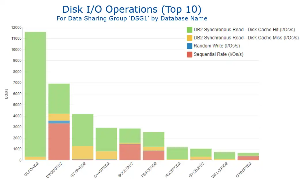 Figure 1: Disk I/O Operations by Database Name
These very distinct I/O profiles are clearly reflected in the view of response times by the standard z/OS components seen in Figure 2. The I/Os for database 1 that are almost exclusively cache hits translate into minimal disconnect time (in yellow), while database 2’s prominent sequential workload generates a sizable connect time component (in green).
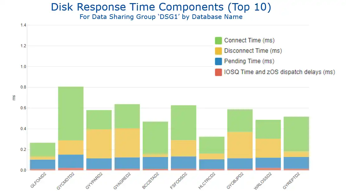 Figure 2: Disk Response Time Components by Database Name
Further analysis of the sequential I/O profile for database 2 by page set shows very different time of day profiles for the two page sets responsible for almost all the sequential activity (see Figure 3).
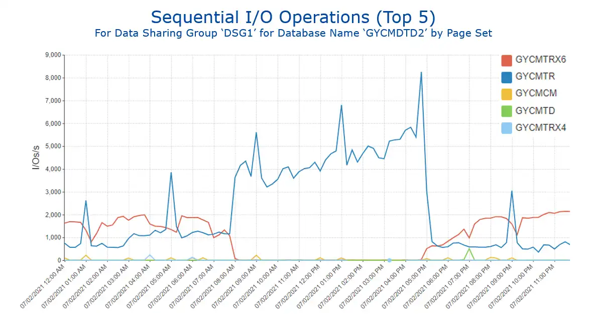 Figure 3: Sequential I/O Operations for Selected Database by Page Set
Understanding of I/O profiles by Db2 database are enhanced by insights provided from integration with SMF 42 data.
Scenario 2: I/O Characteristics by Db2 Buffer Pool
These IFCID 199 and SMF 42 data sources can also provide valuable insights when viewed at the buffer pool level, indicating the performance characteristics of the I/Os that occur when a Db2 getpage cannot be satisfied from a buffer and thus a sync read occurs. Db2 Statistics data (SMF 100) provides sync I/Os by buffer pool, but integration with SMF 42 data indicates the disk cache characteristics of those I/Os.
Viewing the I/O profile for the buffer pool with the highest level of I/O activity (BP21) over the course of a week shows a significant decrease in the middle of the week (Figure 4).
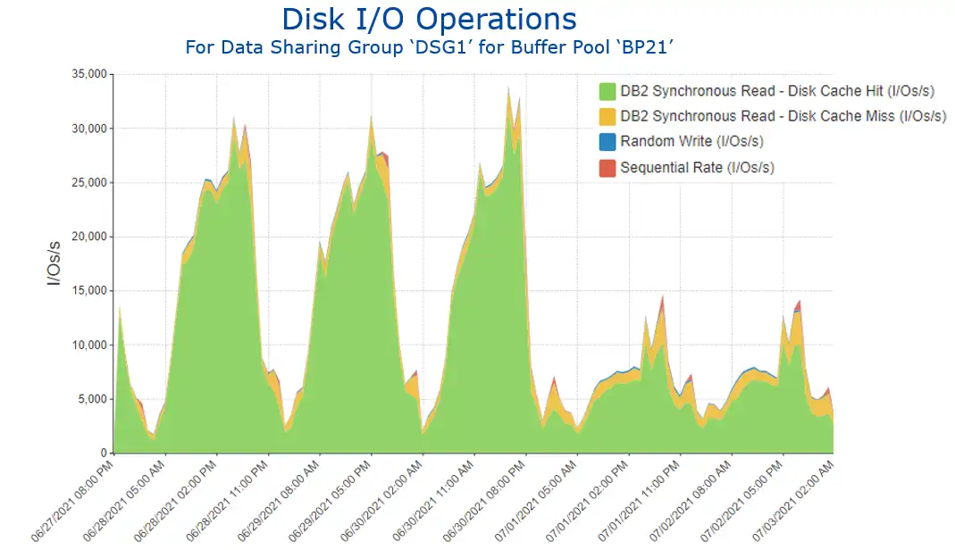 Figure 4: Disk I/O Operations for Buffer Pool ‘BP21’
Drilling into this data (Figure 5) identifies the page set (in red) that greatly benefitted from a SQL tuning change. [Note: The SQL change that generated these significant benefits involved denormalizing tables to avoid running summarization calculations on child rows.]
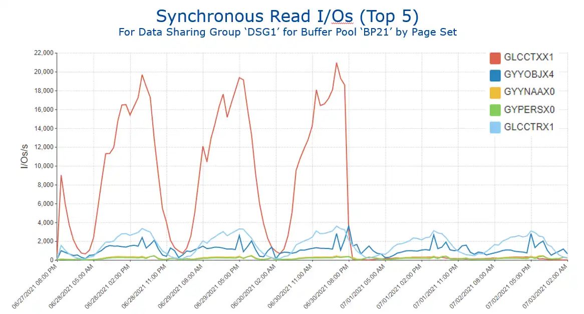 Figure 5: Synchronous Read I/Os for Buffer Pool ‘BP21’ by Page Set
Buffer pool analysis benefits from insights into I/O characteristics provided by SMF 42 data. The next section expands on this theme.
Scenario 3: “Getpage Efficiency”
Another powerful way to leverage this integration of the Db2 IFCID 199 and SMF 42 data is visibility into what we might call “getpage efficiency.” Figure 6 shows this metric for 4K buffer pools with the highest getpage activity, reflecting the three possible outcomes when a getpage requests data:
- The getpage is resolved with a buffer pool hit (in red), the ideal situation.
- It results in an I/O, but the I/O is resolved with a disk cache hit (in blue).
- The least desirable outcome, when satisfying the getpage requires an actual disk I/O (in yellow).
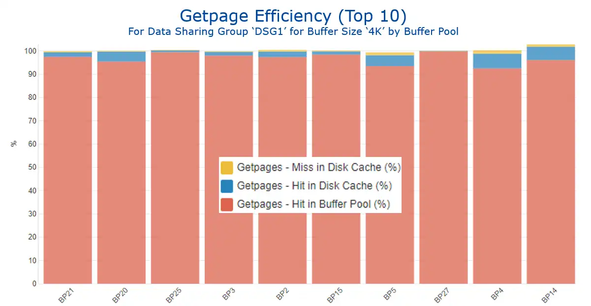 Figure 6: Getpage Efficiency for Buffer Size ‘4K’ by Buffer Pool
This data can be leveraged to help inform buffer pool tuning methodologies, since disk cache hits are an indication of a “second tier” of access. The page did not reside in the Db2 buffer pool long enough to be accessed there, but it was accessed “soon enough” thereafter such that it was still present in the disk cache. So, cache hit volumes (as shown in Figure 7) can be an indicator helping to identify buffer pools that could potentially benefit from being enlarged.
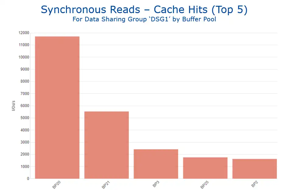 Figure 7: Synchronous Reads – Cache Hits by Buffer Pool
Analysis Enhanced through Viewing Multiple Types of SMF Data
This use case illustrated how having a common interface across Db2 IFCID 199 and SMF 42 data types enhanced analysis by enabling Db2 and storage teams to gain insights into I/O and cache activity and response time data at the Db2 buffer pool and database levels.
Subsequent blogs in this series will continue to provide examples of real-life scenarios where visibility into insights derived from multiple types of SMF data enhances analysis by providing a more complete perspective into the operation of a z/OS environment.
The below video demonstrates the navigation involved in creating these views using IntelliMagic Vision.
This video shows how analysis is enhanced as dataset performance data from SMF 42.6 records provides disk cache and response time data at the Db2 buffer pool and Db2 database levels when integrated with Db2 Statistics IFCID 199 data.
More Integrated Visibility Resources
- Leveraging XCF Message Activity for CPU Efficiency
- Troubleshooting WLM Missed Goals with CICS Transaction Data
- Address Space and Db2 Accounting Data
- Dataset Performance (42.6) and Db2 Buffer Pools & Databases (SMF 102/IFCID 199)
- Db2 GETPAGE Efficiency – Dataset Performance (42.6) and Db2 IFCID 199
- Elapsed Time Profiles by Correlation ID: CICS Transaction (110.1) and Db2 Accounting (101) Part 1
- Analysis of CPU By Plan: CICS Transaction (110.1) and Db2 Accounting (101) Part 2
- Insights You Can Gain from Integrated Visibility Across Types of SMF Data
This article's author
You May Also Be Interested In:
Blog
Viewing Connections Between CICS Regions, Db2 Data Sharing Groups, and MQ Queue Managers
This blog emphasizes the importance of understanding connections in mainframe management, specifically focusing on CICS, Db2, and MQ.
Webinar
A Mainframe Roundtable: The Leaders | IntelliMagic zAcademy
Join industry leaders as they discuss the evolution of mainframes, sharing personal experiences, challenges, and future insights, along with practical advice from their careers in the Z ecosystem.
Webinar
Challenging the Skills Gap – The Next Generation Mainframers | IntelliMagic zAcademy
Hear from these young mainframe professionals on why they chose this career path and why they reject the notion that mainframes are obsolete.
Book a Demo or Connect With an Expert
Discuss your technical or sales-related questions with our mainframe experts today